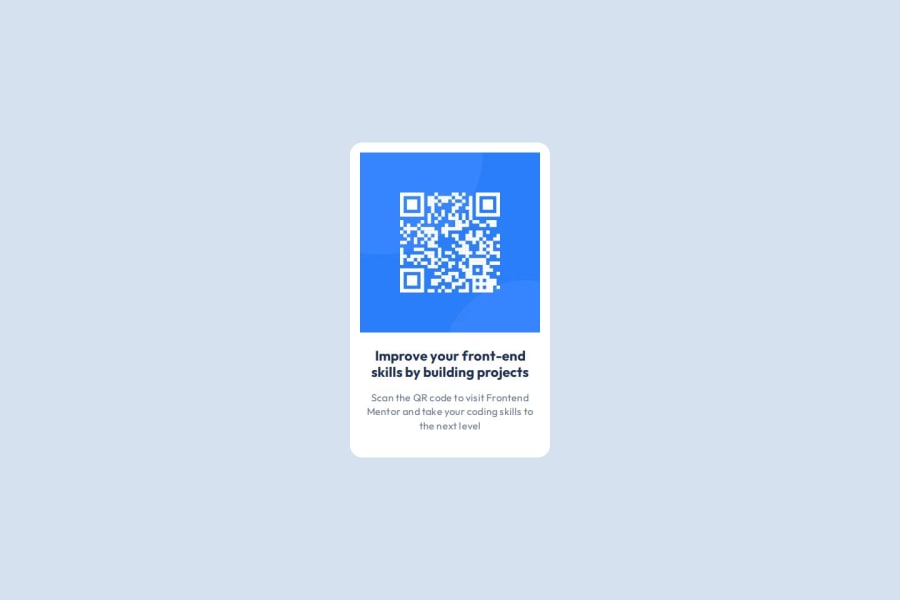
Design comparison
Solution retrospective
To have been able to complete my first challenge in a short time. I believe that for the next challenge I will be able to make the process of uploading the changes and the solution of the project in a faster way.
What challenges did you encounter, and how did you overcome them?So far, none. The challenge was based on the knowledge I have.
What specific areas of your project would you like help with?Could you recommend me good practices to establish styles in a more orderly way?
Community feedback
- @Xerver8694Posted 5 months ago
The solution matches the design perfectly! The HTML is very readable and CSS is very easy to follow as well. The only thing I can say is that all of the links in the head of the index are not entirely necessary to complete the solution. Everything needed is provided in the project files. Overall, a good solution, but could be made simpler.
Marked as helpful0P@devchris03Posted 5 months ago@Xerver8694 Could you detail how I could have made it simpler please? Your help will be useful for my next challenge.
0@Xerver8694Posted 5 months ago@devchris03 For one, all of the links in the head with the "apple-touch-icon" relation are not necessary for this project, at least the way I completed. I am still new to all of this myself, so I would take my input with a grain of salt, but those do not seem needed for a project like this in my view. It is best practice to try to keep your code as simple as possible with adding too much extra.
Marked as helpful0P@devchris03Posted 5 months ago@Xerver8694 I understand.thanks for your help 😁
0
Please log in to post a comment
Log in with GitHubJoin our Discord community
Join thousands of Frontend Mentor community members taking the challenges, sharing resources, helping each other, and chatting about all things front-end!
Join our Discord
