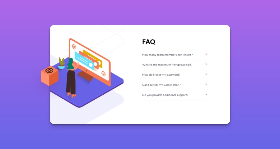
Design comparison
Solution retrospective
My questions for this project are:
-
how did you make the box shadow look right? I tried using multiple shadows but still doesn't look right.
-
I would like some feedback on how I solved the image placement and hiding?
-
How to keep the gradient going until the bottom of the screen on desktop?
Thank you all!
Community feedback
- @pranshudobhalPosted almost 4 years ago
Hi Maya,
To make the box-shadow look right. Check out these videos from Kevin Powell on box-shadow.
https://www.youtube.com/watch?v=TZRSXNc0T1k
https://www.youtube.com/watch?v=Yon4l3MUBGY
It explains how to get that depth effect.
1 - @ApplePieGiraffePosted almost 4 years ago
Hello, Maya Buser De! 👋
Just wanted to say good job on this challenge! 👏 Your solution looks great and the accordion card works well! 👍
I think using absolute positioning to place the floating cube in the desktop layout and the illustration in the mobile layout (like you've done) is definitely the way to go since they both overflow the accordion card and onto the background of the page. Using CSS background images to add the illustration in the desktop layout is nice, too, since you don't have to worry about it overflowing the container, then. Good work! 🙌
Keep coding (and happy coding, too)! 😁
0 - @istirPosted almost 4 years ago
It seems that your problem with gradient is caused by 'body' not being stretched out to the whole page. I would usually fix it with either setting "height: 100vh, overflow: hidden" to body or setting 'html' to "height:100%, width: 100%"
0
Please log in to post a comment
Log in with GitHubJoin our Discord community
Join thousands of Frontend Mentor community members taking the challenges, sharing resources, helping each other, and chatting about all things front-end!
Join our Discord
