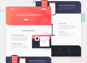
Design comparison
SolutionDesign
Solution retrospective
Hello,
I would love some feedback on my project.
I have struggled with the images quite a lot on desktop mode. De two sections with the images don't match with the design and it is quite ugly i.m.o.
Can someone please give me some tips on how i can make this match the design. Would be really helpful. And if you see something odd please let me now, I will try to fix it.
Cheers!
Community feedback
Please log in to post a comment
Log in with GitHubJoin our Discord community
Join thousands of Frontend Mentor community members taking the challenges, sharing resources, helping each other, and chatting about all things front-end!
Join our Discord
