Submitted over 3 years ago
Solution using plain HTML and CSS (Flexbox)
@FahimMahmudJoy
Design comparison
SolutionDesign
Solution retrospective
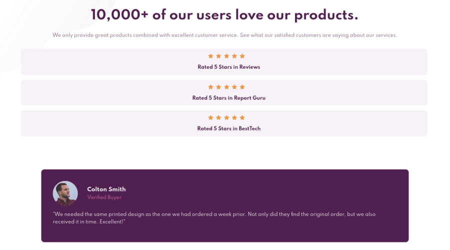
- I had to repeat the star images five times. Is there any shortcut?
- In the reviews section, I had to manually adjust each individual review margin top and bottom to set them into place (gradually descending). Can I use some flexbox tricks to achieve this in a more structured way?
- I couldn't reduce the size of the rounded image although I tried to set width, min-width, max-width etc. Nothing seemed to work. I wonder why. Thanks in advance for all your valuable insights and suggestions.
Community feedback
- @afrusselPosted over 3 years ago
When I checked it in 1920x1024 screen size then its look good. But in laptop view like 1360x 768 its not good at all. Found many problem in media queries. Please fix this
0
Please log in to post a comment
Log in with GitHubJoin our Discord community
Join thousands of Frontend Mentor community members taking the challenges, sharing resources, helping each other, and chatting about all things front-end!
Join our Discord
