Design comparison
Solution retrospective
I really liked the way this turned out and it was a great project to learn Next.js.
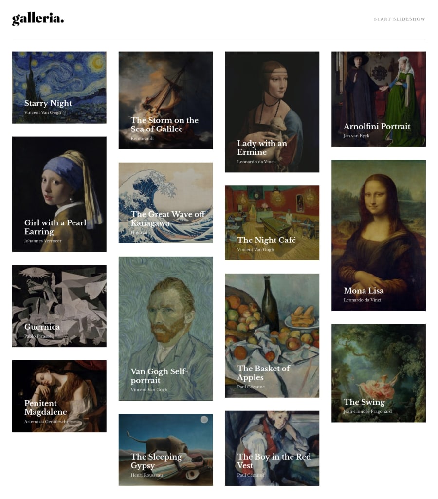
I wish I could have figured out exactly how to get the Masonry layout moving across rows instead of down columns but I'll keep looking for a good solution to that.
Community feedback
- @mattstuddertPosted over 3 years ago
Awesome work on this project, Brian! I hadn't realised Next.js added the
placeholder="blur"
attribute now as well, which is nice. We'll need to do some refactoring to add theplaceholder
attribute to the Frontend Mentor site now as well! 😆My main piece of feedback would be to not put event listeners on non-interactive elements, like
div
elements. For example, the element you're using to bring up the gallery modal is adiv
. This means anyone using a keyboard or other assistive technologies to navigate the site might not be able to access that content.The best thing to do is use anchors or buttons for interactive content. In this instance, a
button
would make sense as you're staying on the same page. This will ensure people navigating in other ways beyond a mouse/trackpad will be able to interact with your content.I hope this helps. Keep up the great work! 👍
1@brianlfarmerllcPosted over 3 years ago@mattstuddert Its sure does. This is a really great project by the way. Even though I've submitted it Im working to improve on this one and accessibility is one thing I want to tackle so I will be updating those div's to buttons here in the near future.
1@mattstuddertPosted over 3 years ago@brianlfarmerllc nice work! One more small update that could be made is adding descriptive
alt
attributes to the previous/next slide buttons. Withoutalt
attributes, screen readers will read out the file path. I just noticed this when navigating using a keyboard and VoiceOver.It's great to hear you enjoyed the project! Taking some time to refine projects after submission is well worth it. Much better than moving onto the next challenge immediately!
0 - @afrusselPosted over 3 years ago
Nice work. Looking good in all types of device. I am learning reactjs. It helps me a lot to learn
1@brianlfarmerllcPosted over 3 years ago@afrussel Yeah this was a great project for the react frame work Next.js. Was my first time using it and I learned a ton. The Nextjs tutorial in their docs taught me everything I needed to know in order to use the framework on this project. I included a link to that tutorial in my readme.
0 - @ChamuMutezvaPosted over 3 years ago
It's looking good on mobile. Well done, will go over your code when I am back on my desktop to learn how you did it.
1@brianlfarmerllcPosted over 3 years ago@ChamuMutezva Thanks a bunch. I plan on continuing to work on this one. I want to improve the image optimization and incorporate some animations as well as figure out how to get the masonry layout to work with the rows instead of columns. I know there are library's to do this I just need to look further into it. Ill be glad when grid-template-rows: masonry gets more browser support. That will make it so much easier with pure css.
1
Please log in to post a comment
Log in with GitHubJoin our Discord community
Join thousands of Frontend Mentor community members taking the challenges, sharing resources, helping each other, and chatting about all things front-end!
Join our Discord