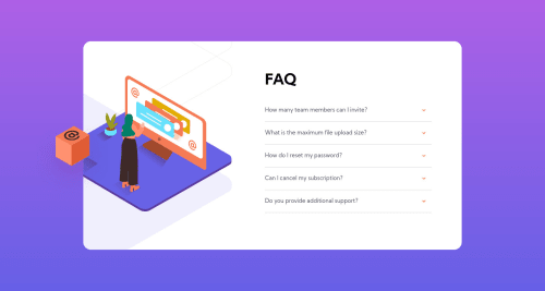
Design comparison
Solution retrospective
Any feedbacks are highly appreciated.
Thanks in advance!!
Community feedback
- @anas-cdPosted over 3 years ago
seems great, just try to change the arrow direction when the question box is opened
also when the screen is at mobile width (~375px) the picture gets hidden and the user can't scroll up to it, especially if there are multiple questions opened at the same time.
Marked as helpful0@abhineetkandelePosted over 3 years ago@anas-cd Thanks for the feedback!! I Will work on your comments.
0 - @AlatmalPosted over 3 years ago
Dude, I am just copying your solution for SVG images. I was having a terrible nightmare with hidden overflow and absolute position, your approach is much better.
0@abhineetkandelePosted over 3 years ago@Alatmal I can totally understand. Even for me, it took a lot of time.
Feel free to copy anything. Do let me know if you see any issue or anything that you feel could have been done better.
0
Please log in to post a comment
Log in with GitHubJoin our Discord community
Join thousands of Frontend Mentor community members taking the challenges, sharing resources, helping each other, and chatting about all things front-end!
Join our Discord