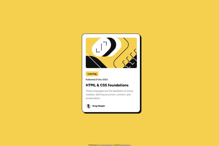
Solution using Hover Effects and Flexbox Layout using HTML & CSS
Design comparison
Solution retrospective
What I'm most proud of:
I'm proud of how I effectively utilized CSS techniques such as hover effects and flexbox layout to create a visually appealing and interactive blog preview card. The implementation of these features adds an extra layer of interactivity and polish to the design, enhancing the overall user experience.
What I would do differently next time:
Next time, I would aim to improve the accessibility and responsiveness of the project further. While I ensured basic responsiveness with meta tags and flexible units, I believe there's always room for improvement in making the design more accessible to a wider range of users across different devices and screen sizes. Additionally, I would explore more advanced CSS features and techniques to further enhance the visual aesthetics and functionality of the project.
What challenges did you encounter, and how did you overcome them?Challenges Encountered:
One challenge I encountered was handling the size of images within the blog preview card.
How I Overcame Them:
To address this challenge, I employed CSS techniques such as setting maximum width and height properties to control how the images were displayed within .illustration img. Regular testing and tweaking were also crucial in fine-tuning the image sizes to achieve the desired aesthetic while maintaining optimal performance and user experience.
Implementing Shadow Animation
Question: I'm trying to add a shadow animation to the card when the user hovers over the heading inside the card. I want the shadow to smoothly transition from a subtle shadow to a more pronounced one on hover. However, I'm not sure how to achieve this effect with CSS animations. Can someone provide guidance or code examples on how to create this hover effect using CSS?
Community feedback
- @dieherramPosted 10 months ago
Congratulations! I have a task to take from your code: implementing 'position' with both 'absolute' and 'relative' to position elements. I really liked what you've done. Typically, I use Grid and Flexbox.
0
Please log in to post a comment
Log in with GitHubJoin our Discord community
Join thousands of Frontend Mentor community members taking the challenges, sharing resources, helping each other, and chatting about all things front-end!
Join our Discord
