Design comparison
Solution retrospective
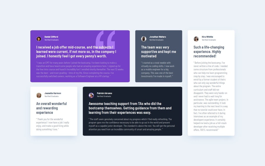
In the design comparison my solution looks different than the design (upper paragraph is narrower in the first testimonial), but on the github live page and on my live server it looks right. When I was writing the CSS code I tried to use rem units for the font sizes but for some reason it didn't work so I had to use pixels. Any ideas?
Community feedback
- @TheTrueScoutPosted 6 months ago
i think your font size for the header is slightly bigger, and maybe you could play with padding for the
(upper paragraph is narrower in the first testimonial),. Great job though, i love it :)1
Please log in to post a comment
Log in with GitHubJoin our Discord community
Join thousands of Frontend Mentor community members taking the challenges, sharing resources, helping each other, and chatting about all things front-end!
Join our Discord
