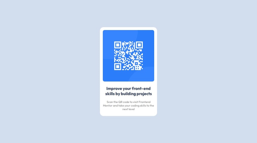
Design comparison
Solution retrospective
I had difficulty aligning the content using flexbox
Community feedback
- @kotangenssPosted 6 months ago
Your solution includes basic semantic HTML, which is good practice. Using tags such as <main>, <h1>, and <p> improves structure and accessibility. However, you can improve your semantic markup by adding <section> or <article> tags to make your content structure clearer.
The solution has basic accessibility through the use of alt attributes for images.
The layout adapts well to different screen sizes. The code is well structured and readable.
All the main styles and markup are in place, making the code easy to understand and modify. Avoid redundancy: for example, the text-align: center property can be defined once for the .text class.
The solution basically corresponds to the project and the requirements of the assignment. The appearance, structure and functionality correspond to the expected results. However, attention to detail can always be improved to provide a more professional and polished look. For example, you need to reduce the font of both text elements and increase their padding.
Your solution is a good basic implementation using semantic HTML, modern CSS techniques, and basic accessibility. Some of the div tags are unnecessary in my opinion, but overall great job!
1
Please log in to post a comment
Log in with GitHubJoin our Discord community
Join thousands of Frontend Mentor community members taking the challenges, sharing resources, helping each other, and chatting about all things front-end!
Join our Discord
