Design comparison
Solution retrospective
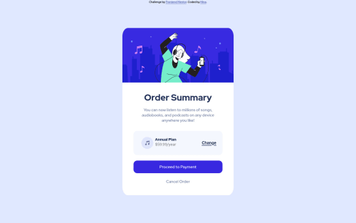
What code should I use to make it the box smaller for mobile page? I tried to use the media query for responsive page but I don't know why they didn't work.
Community feedback
- @correlucasPosted over 2 years ago
👾Hello @miina-o, Congratulations on completing this challenge!
Great code and great solution! I’ve few suggestions for you that you can consider adding to your code:
1.The image is not displaying due and error of import, the location of the image is wrong, you dont need to put slash since the image is out a folder, see the correct import:
body { font-family: 'Red Hat Display', sans-serif; min-height: 100vh; background-image: url(pattern-background-desktop.svg); background-repeat: no-repeat; background-color: hsl(225, 100%, 94%); position: relative; }
2.Use
<main>
instead of<div>
to wrap the card container. This way you show that this is the main block of content and also replace the div with a semantic tag.3.Replace the
<h2>
containing the main title with<h1>
note that this title is the main heading for this page and every page needs one h1 to show which is the most important heading. Use the sequence h1 h2 h3 h4 h5 to show the hierarchy of your titles in the level of importance, never jump a level.4.Add the website favicon inserting the svg image inside the
<head>
.<link rel="icon" type="image/x-icon" href="./images/favicon-32x32.png">
✌️ I hope this helps you and happy coding!
Marked as helpful0
Please log in to post a comment
Log in with GitHubJoin our Discord community
Join thousands of Frontend Mentor community members taking the challenges, sharing resources, helping each other, and chatting about all things front-end!
Join our Discord