Submitted about 1 year ago
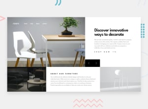
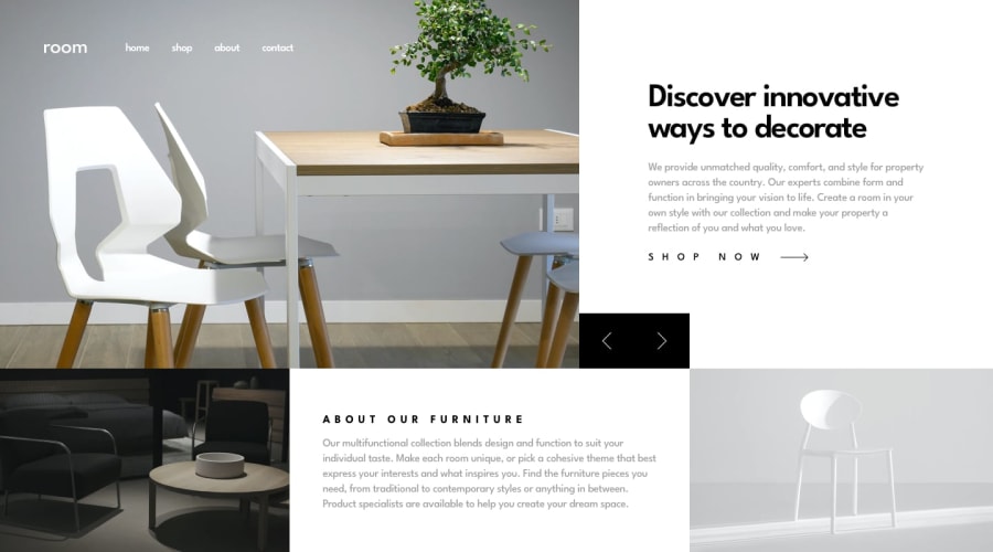
Solution To The Challenge Of(Room-Homepage-Master )
@JohanXTheKing
Design comparison
SolutionDesign
Solution retrospective
- Hi, guys. I would like to know if there is a way to make this code even cleaner, I feel that I am using too much code for something that could be simpler. Any council please do not hesitate to comment on it.
Community feedback
- @ogunsanwodavidPosted about 1 year ago
I suggest you use flex throughout. Don't even consider grid except for the slider/carousel maybe. Also, set height of major-sections of desktop-mode in vw and vh for easy-scaling.
0
Please log in to post a comment
Log in with GitHubJoin our Discord community
Join thousands of Frontend Mentor community members taking the challenges, sharing resources, helping each other, and chatting about all things front-end!
Join our Discord
