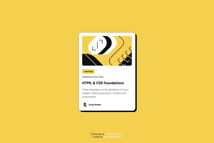
Solution to the "Blog Preview Card Component"-Project using HTML/CSS


Design comparison

Solution retrospective
I’m most proud of how clean and organized my code turned out, especially with the use of CSS variables and Flexbox for layout. It feels great knowing the design is not only responsive but also accessible, with ARIA labels and focus-visible styles for better keyboard navigation. Adding the skip link was a small but meaningful touch that enhances usability.
I’m also really happy with the modern, polished look of the card component. The hover effects and the box-shadow give it a nice, interactive feel without being overwhelming.
What I Would Do Differently Next Time
I’d explore adding subtle animations or transitions to make interactions even smoother.
Additionally, I’d like to test the project more thoroughly with screen readers and accessibility tools to ensure it works seamlessly for all users.
What challenges did you encounter, and how did you overcome them? Challenges I EncounteredOne of the main challenges I faced was ensuring the card layout stayed responsive and visually appealing across different screen sizes. Balancing the use of min-width and max-width properties while ensuring proper padding and spacing required some trial and error.
Another challenge was improving accessibility. Adding ARIA attributes, focus styles, and a skip link involved a lot of research to ensure everything worked correctly for keyboard users and screen readers.
How I Overcame Them
To address the responsiveness issue, I used Flexbox for layout and defined clear min-width and max-width values for the container and card. This allowed the design to adapt while maintaining its structure.
For accessibility, I referred to resources like MDN Web Docs and accessibility guidelines to understand best practices. Testing the solution with keyboard navigation helped identify areas for improvement, such as adding more prominent focus-visible styles and refining ARIA labels for better context.
What specific areas of your project would you like help with? What Specific Areas of My Project Would I Like Help With?I would love to get suggestions on:
1️⃣ CSS Grid or CSS Libraries
- How could I recreate the same layout using CSS Grid instead of Flexbox?
- Would using a CSS library like Bootstrap or Tailwind improve the scalability and maintainability of the project? If so, how should I approach it?
2️⃣ Animations to Enhance Visual Appeal
- What types of animations could I add to make the project stand out without overwhelming the user?
- I’m considering animations for hover effects, transitions between elements, or maybe even subtle entrance animations—any ideas or best practices here would be greatly appreciated!
Thank you in advance for your insights! 😊
Community feedback
Please log in to post a comment
Log in with GitHubJoin our Discord community
Join thousands of Frontend Mentor community members taking the challenges, sharing resources, helping each other, and chatting about all things front-end!
Join our Discord