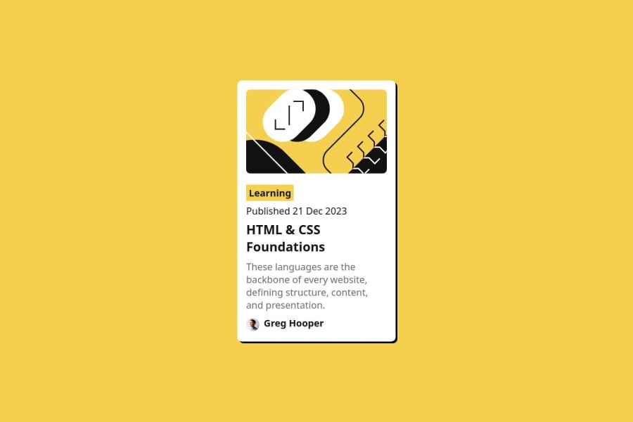
Solution to the Blog preview card challenge on Frontend Mentor
Design comparison
Solution retrospective
I am most proud of starting and finishing this project, i did not allow procrastination make me leave the project halfway. Next time i will try to finish the project much faster.
What challenges did you encounter, and how did you overcome them?At first, it was difficult to center the div, a popular challenge most frontend developers face which has various solutions already. Finally, after going through some of my older projects as a learning reference, i found a solution that fits this project.
What specific areas of your project would you like help with?I will like help with the accessibility features as usual and probably with the responsiveness to fit literally all devices.
Please log in to post a comment
Log in with GitHubCommunity feedback
No feedback yet. Be the first to give feedback on AllisonFavour's solution.
Join our Discord community
Join thousands of Frontend Mentor community members taking the challenges, sharing resources, helping each other, and chatting about all things front-end!
Join our Discord

