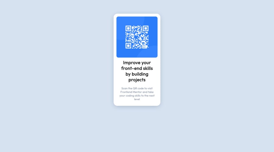
Solution to QR Code card made with HTML and CSS
Design comparison
Community feedback
- @denieldenPosted almost 3 years ago
Hi Gabriel, great job!
Try to remove all
marginfromqrandtextclass and use flexbox to the body for center the card. Read here -> flex guideAlso set
heigthof body to100vhbecause Flexbox aligns to the size of the parent container.Hope this help and happy coding :)
Marked as helpful1@CorvielPosted almost 3 years ago@denielden Thank you for your feedback! I don't know much about the different units i can use, but that's the next thing i'll learn! And yeah, i had a rough time trying to figure out how to center everything. Also, thanks for the flex guide, that's exactly the one i used to learn and make this solution! :)
1 - @JohnIdenyiPosted almost 3 years ago
Hi, nice work. I would suggest increasing the width of the .qrandtext class element to 25% or more and also set a media query and increase the width to 85% for the same class so it can scale well on mobile devices.
Marked as helpful1@CorvielPosted almost 3 years ago@JohnIdenyi Thank you for your response!!! Appreciate the feedback. And yes, i'm aware it's not responsive at all. But that's only because i didn't reach the responsive classes on the course i'm taking, so instead of taking a big risk and messing everything up i used absolute units and did my solution only for desktop.
0
Please log in to post a comment
Log in with GitHubJoin our Discord community
Join thousands of Frontend Mentor community members taking the challenges, sharing resources, helping each other, and chatting about all things front-end!
Join our Discord
