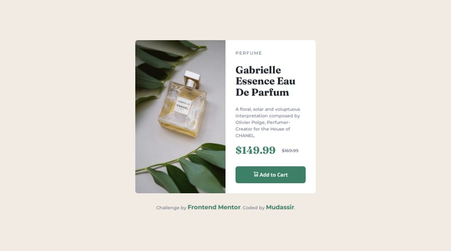
Solution to Product Preview Using Grid (Easy to Understand).
Design comparison
Please log in to post a comment
Log in with GitHubCommunity feedback
- @luisgustavogorniak
Well done! It looks very close to the design!
There are two points that I consider relevant:
Just be careful when setting the
widthof the elements, depending on the user's viewport, the card will look messy. Instead, try changing it tomin-width, so when the viewport changes, it will look as expected.When working with responsive pages, I recommend that you use the mobile concept first and then adapt it to a larger viewport. You will see that it is much easier to code than the other way around and, after all, people use their mobile devices much more than desktop computers, so to speak.
Other than that your project looks really great! I hope my review is useful! Have a good one and keep coding!
Marked as helpful
Join our Discord community
Join thousands of Frontend Mentor community members taking the challenges, sharing resources, helping each other, and chatting about all things front-end!
Join our Discord
