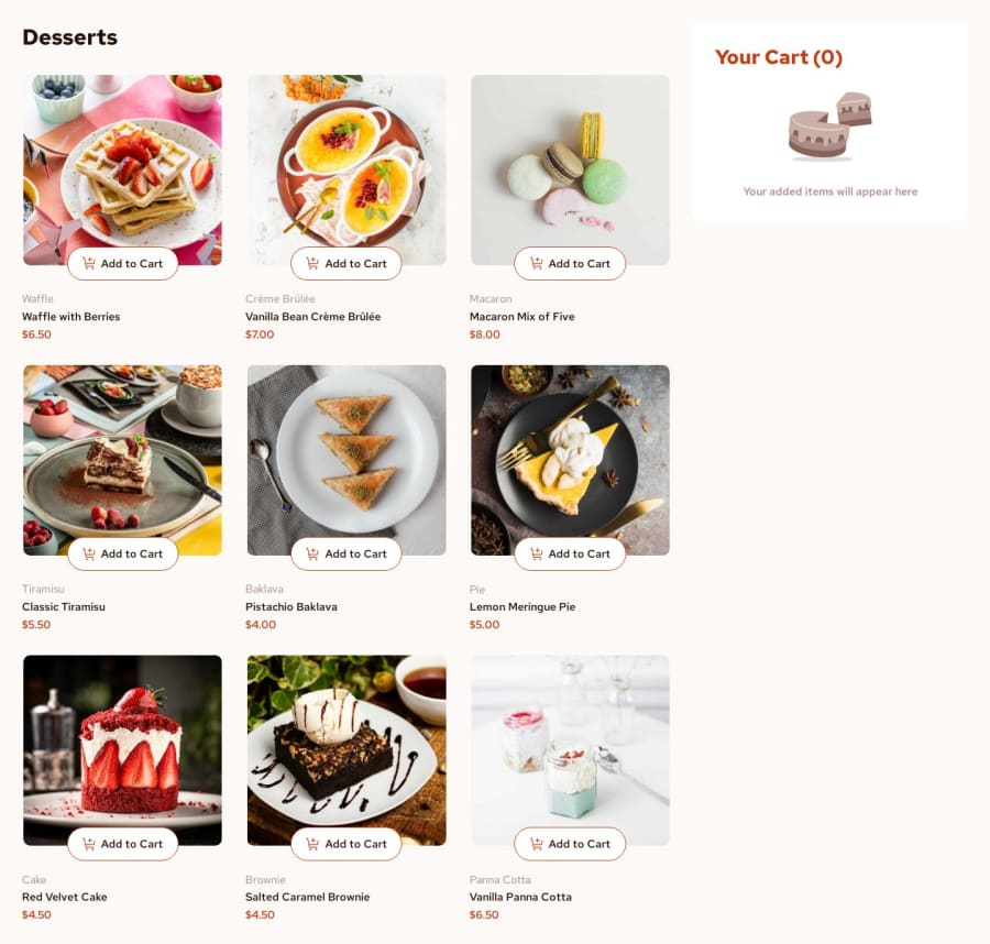
Design comparison
Solution retrospective
I used to use position for all the layouts, but now I am very comfortable with creating layouts with grid and flexbox. On the other hand, I used to select items using parent and sibling elements. However, I've learned about the "data-" attribute and now I can retrieve the data easily. Literally satisfied with this progress. I hope I keep on making genuine progress.😎😎
What challenges did you encounter, and how did you overcome them?I encounter the error of "Faild to Load", but thanks to all of my dedicated fellows around the internet, I figured out how to solve it😮💨. Other than that, I tried to use the fonts downloaded within the challenge, but I failed to do so.🥲
What specific areas of your project would you like help with?I tried to use the fonts downloaded within the challenge, but I failed to do so. I tried using @font-face, but since I was new to it, I couldn't get it right. I would love you to offer me some suggestions so that I can use it without struggling with it anymore. I will literally appreciate it.😁😁😁
Community feedback
Please log in to post a comment
Log in with GitHubJoin our Discord community
Join thousands of Frontend Mentor community members taking the challenges, sharing resources, helping each other, and chatting about all things front-end!
Join our Discord
