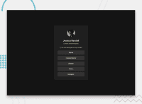
Design comparison
SolutionDesign
Solution retrospective
What are you most proud of, and what would you do differently next time?
it is a nice challenge but next time ill add my personal picture and account links maybe for my portfolio
What challenges did you encounter, and how did you overcome them?editing the cursor to pointer
Community feedback
- @RahexxPosted 4 days ago
Overall, good job! In the future, check the positioning of elements in the design. For example, your modal is currently at the top but should be centered. Also, remember to check the whitespace; there is less whitespace on the Y-axis around the buttons. For your next project, you could try moving the CSS styles to a separate file and importing them into your HTML.
Marked as helpful0
Please log in to post a comment
Log in with GitHubJoin our Discord community
Join thousands of Frontend Mentor community members taking the challenges, sharing resources, helping each other, and chatting about all things front-end!
Join our Discord

