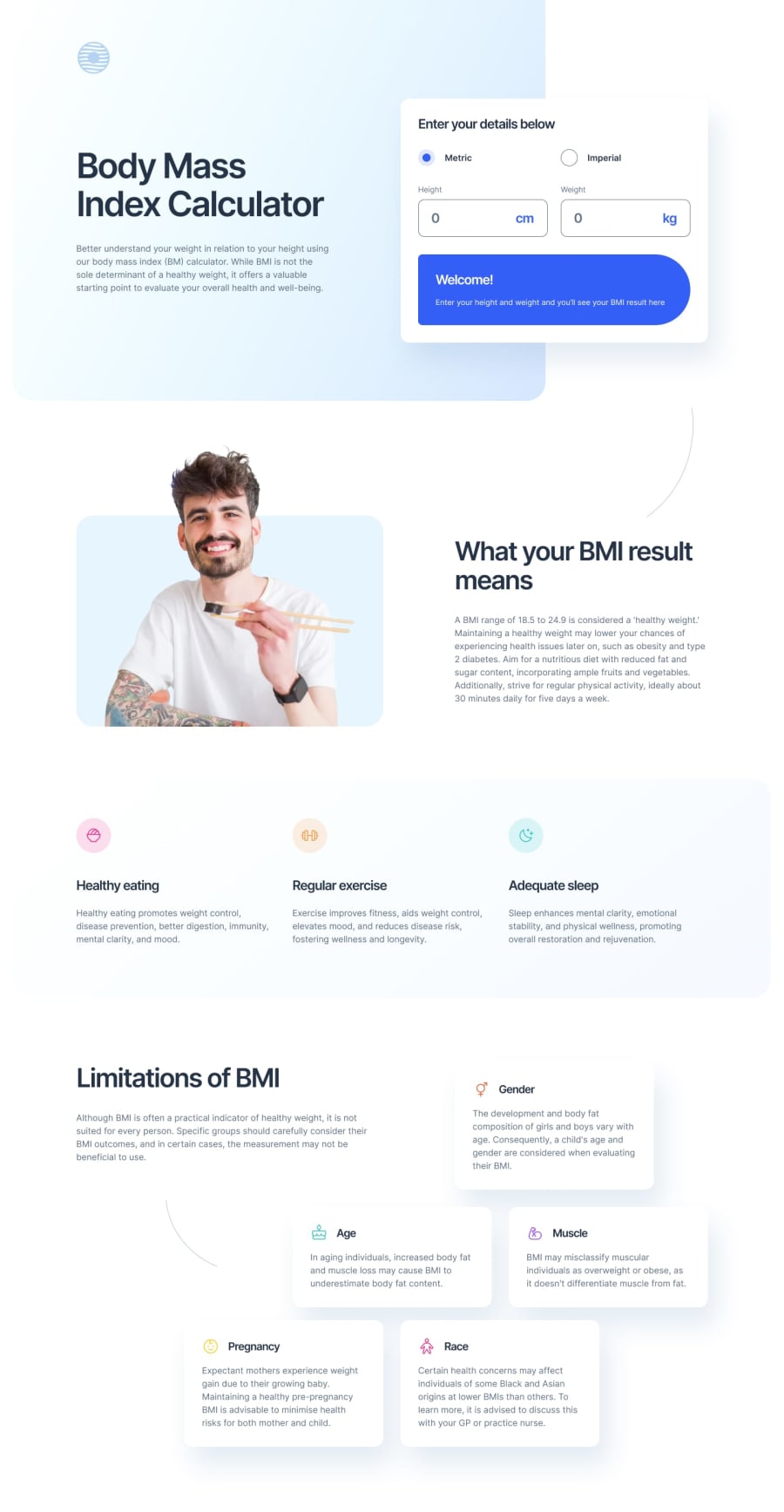
Design comparison
Solution retrospective
Not gonna lie, the darn BMI calculator logic kinda tied me up more than I would have cared. Less in being able to get calculations and more just in that I found with the 2 units I had created a bunch of functions that essentially did the same thing so "enjoyed" trying to clean that up a bit in my JS. Definitely not perfect but a bit tidier. Fun design style with with the bottom cards having a somewhat unique arrangement on desktop. Added a couple of intersectionObserver animations but nothing grand, also added some calculator output logic with different text colors depending on users 'health' status. Feedback and suggestions welcomed! 🙂
Community feedback
Please log in to post a comment
Log in with GitHubJoin our Discord community
Join thousands of Frontend Mentor community members taking the challenges, sharing resources, helping each other, and chatting about all things front-end!
Join our Discord
