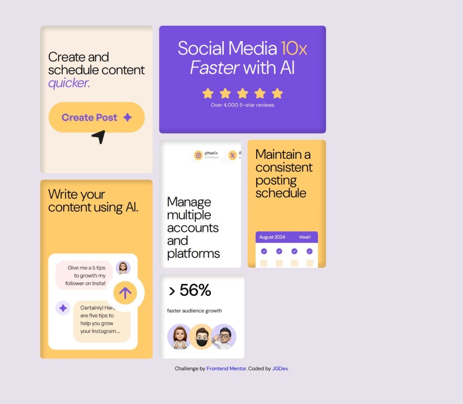
Design comparison
Solution retrospective
I don't love that I fudged a few magic numbers for a gap area and for a few images. Overall it seems to have turned out alright looking but, would certainly welcome suggestions for cleaner approaches on image size handling without reaping total havoc on parent containers.
What challenges did you encounter, and how did you overcome them?A couple of the image handing instances and the fact flex:1 flex:2 didn't quite work out as I wanted on the right side column between the 2 rows. I think I understand why but it was annoying it worked out that way and would welcome suggestions on a better approach to something like this.
What specific areas of your project would you like help with?The earlier stated issues. The images that seem translated off the cards, it's clear the social media icons one is larger/occupies more space in the card than mine does but again, I found other size-ing approaches to effect the UI and start to turns things into a grid container that's becoming larger than desired.
Community feedback
Please log in to post a comment
Log in with GitHubJoin our Discord community
Join thousands of Frontend Mentor community members taking the challenges, sharing resources, helping each other, and chatting about all things front-end!
Join our Discord
