Design comparison
Solution retrospective
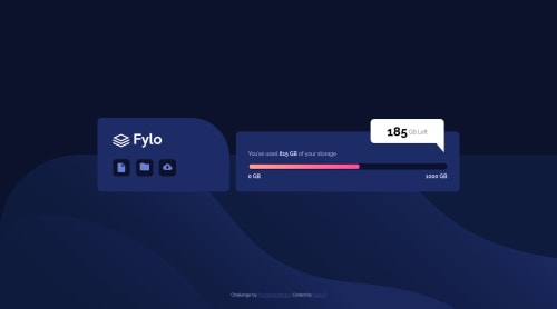
It was a new finding to me that there was a <progress>
bar element in html.
But it was very hard to customize it. Had to deal with a lot of vendor-prefixes.
- If you are opening this webpage on firefox you can see the progress bar animation. On chrome or any other browsers though, it won't work.
- This is the first time I used the browser header background color meta tag (which basically changes the background color of the browser's header bar on mobile devices).
<meta name="theme-color" content="#0c122c" />
<meta name="apple-mobile-web-app-status-bar-style" content="#0c122c" /> //👈 for safari
A Dumb Mistake
If you open the repo of this webpage, you can see that there are some npm package files and procfiles and stuff. Why do you need that?
well... I wanted to make the progress bar actually show how much storage left on their computer when someone visits that page. So I installed some node modules that do that (at least I thought it would do that), and hosted it on Heroku. I thought it was possible to do this. But, turned out, I was just being stupid.😐
However, you can do that if the backend code is running on your computer. If you want to see it happening, you can clone the repo and install the node modules (npm install
). And type node node
. and then if you open this webpage, you can see that it is working.
Hoo...
Community feedback
- @brasspetalsPosted over 3 years ago
Hi, Faris! Congrats on completing another challenge! 🎉 It looks great, responds nicely, and the meter animation on load is a nice touch. 🙌
When I did this project, I tried so hard to get either a
meter
or aprogress
bar to work here, but right now they're both cross-browser-compatibility styling nightmares. At this point in time, I don't think it's possible to use either and have the styling perfectly match the design. Huge points to you for trying!A small suggestion would be to add
cursor: pointer
to your buttons to better indicate interactivity. 👍Great job on this one! Happy coding!
1 - @palgrammingPosted over 3 years ago
Wow this is much more than just a challenge here. Reading your journey on this project it seems like you learned lots. I opened it in Firefox first before reading your whole description and saw the animation and it was really nice. I did wonder why the dot did not move with the range as it changed. Then I read this and opened in Chrome and no animation but the page still looked great... Good Job and I will now ready about the <progress> tag Thanks
1@FarisPalayiPosted over 3 years agoOh. I did try to make the dot animate. But: You can animate pseudo-elements on the progress tag on chrome, can't on Firefox. (that dot is a pseudo-element). You can't animate progress bar on chrome, can on Firefox. It's a bit ironic.
1@palgrammingPosted over 3 years ago@FarisPalayi very interesting did you have to make the dot a pseudo-element why would not not have just put a div in the progress bar and made the dot and then aligned it in the bar?
1@FarisPalayiPosted over 3 years ago@palgramming I have also tried that. But didn't work. Browser doesn't show div inside progress tag. At least not on chrome.
1@palgrammingPosted over 3 years ago@FarisPalayi OK thanks just wondered that seemed simpler than pseudo-elements
1
Please log in to post a comment
Log in with GitHubJoin our Discord community
Join thousands of Frontend Mentor community members taking the challenges, sharing resources, helping each other, and chatting about all things front-end!
Join our Discord