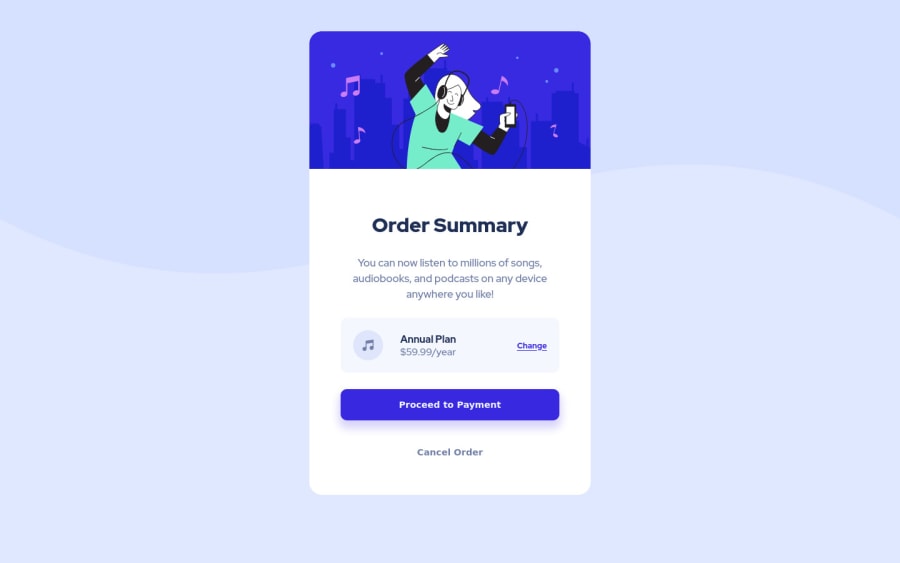
Design comparison
Solution retrospective
What should I do to make the desktop to mobile transition more subtle? Try resizing the window from 1440p (desktop) to 375p (mobile)
Community feedback
- @VCaramesPosted about 2 years ago
Hey there! 👋 Here are some suggestions to help improve your code:
Regarding you question, you can gradually reduce the component. Here is what I did with my challenge:
https://www.frontendmentor.io/solutions/order-summary-component-css-flex-and-clamp-B3BEt42v0-
- To center you content to your page, add the following to your Body Element:
body { min-height: 100vh; display: grid; place-content: center; }-
The “Illustration” and Music Icon serves no other purpose than to be decorative; they add no value. Their Alt Tag should left blank and have an aria-hidden=“true” to hide it from assistive technology.
-
The “Cancel Order” was created with the incorrect element. When the user clicks on the button they should directed to a different part of you site. The Anchor Tag will achieve this.
-
Implement a Mobile First approach 📱 > 🖥
With mobile devices being the predominant way that people view websites/content. It is more crucial than ever to ensure that your website/content looks presentable on all mobile devices. To achieve this, you start building your website/content for smaller screen first and then adjust your content for larger screens.
If you have any questions or need further clarification, let me know.
Happy Coding! 👻🎃
0
Please log in to post a comment
Log in with GitHubJoin our Discord community
Join thousands of Frontend Mentor community members taking the challenges, sharing resources, helping each other, and chatting about all things front-end!
Join our Discord
