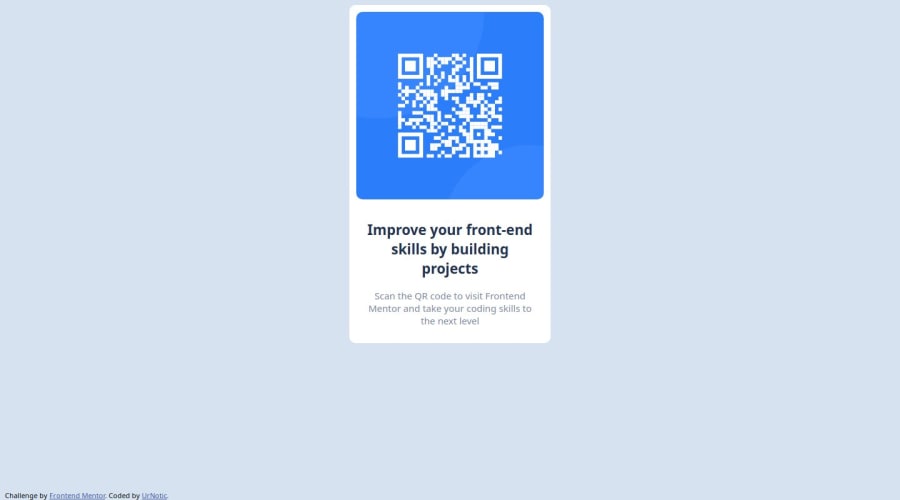
Design comparison
Solution retrospective
proud of having it look very similar to original
I'd like to make it more responsive to screen size
What challenges did you encounter, and how did you overcome them?There wasn't very challenging just basic HTML and CSS understanding
What specific areas of your project would you like help with?positioning of the QR code
Community feedback
- P@Islandstone89Posted 11 months ago
HTML:
-
The alt text must also say where it leads(frontendmentor website).
-
Use
<p>for the footer text.
CSS:
-
It is best practice to write CSS in a separate file, often called
style.css. Create one in the same folder as theindex.html, and link to it in the<head>:<link rel="stylesheet" href="style.css">. -
Including a CSS Reset at the top is good practice.
-
Add around
1remofpaddingon thebody, so the card doesn't touch the edges on small screens. -
Remove the margin on the card.
-
To center the card and the footer horizontally and vertically, use Flexbox on the body. You must also add some space between them using
gap:
display: flex; flex-direction: column; justify-content: center; align-items: center; min-height: 100svh; gap: 2rem;-
Remove the width on the card - setting fixed sizes in
pxis not recommended, as we want our components to be able to adapt to different screens. -
Add a
max-widthof around20remon the card, to prevent it from getting too wide on larger screens. -
font-sizemust never be in px. This is a big accessibility issue, as it prevents the font size from scaling with the user's default setting in the browser. Use rem instead. -
Since all of the text should be centered, you only need to set
text-align: centeron the body, and remove it elsewhere. The children will inherit the value. -
I would increase the
paddingon the card to around16px. -
On the image, add
display: blockand changewidthtomax-width: 100%- the max-width prevents it from overflowing its container. Remove thez-index, it is not needed.
Hope this is helpful - good luck :)
Marked as helpful1 -
- @Luca-SousaPosted 11 months ago
Hello everything is fine? My name is Lucas, nice to meet you. A suggestion for your code is to use display flex, to center the container div in the center of the page, using align-items center and justify-content center.
1
Please log in to post a comment
Log in with GitHubJoin our Discord community
Join thousands of Frontend Mentor community members taking the challenges, sharing resources, helping each other, and chatting about all things front-end!
Join our Discord
