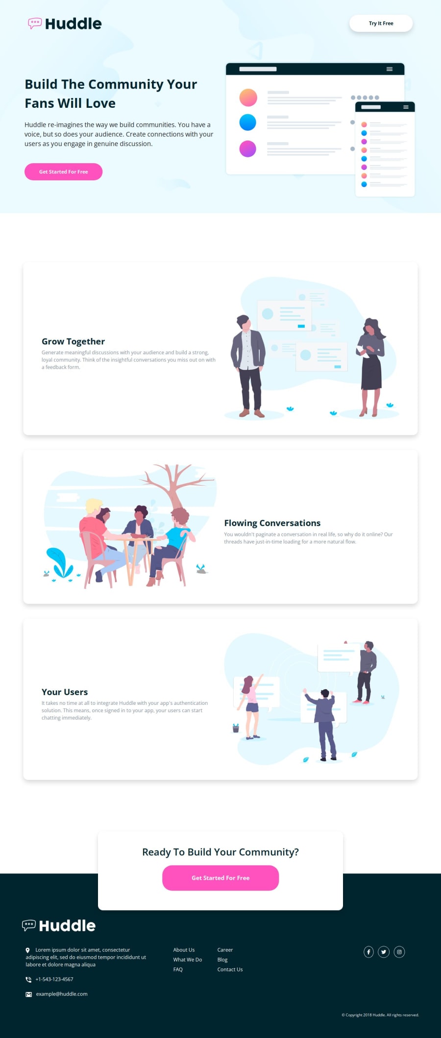
Solution Huddle landing page with alternating feature blocks
Design comparison
Community feedback
- @petritnurediniPosted about 1 year ago
Congratulations on completing your Frontend Mentor project! Your dedication and hard work have clearly paid off in creating a visually appealing and functional website. Here are some best practices and recommendations to enhance your skills further:
-
Consistent Code Formatting: Ensure your HTML and CSS are consistently formatted. This includes consistent use of indentation, spacing, and bracket placement. Tools like Prettier or ESLint can automate this process.
-
Semantic HTML: Use semantic HTML tags where appropriate. For instance, consider using
<section>for defining sections in your body content, and<footer>for the footer content. This improves accessibility and SEO. -
CSS Variables: Great job using CSS variables! This practice enhances maintainability. You might consider adding more variables for repeated values like margins, paddings, or common layout dimensions.
-
Media Queries Organization: To maintain readability, consider organizing your media queries. Either include them at the bottom of your CSS file or directly within the respective selectors. Consistency in approach is key.
-
Responsive Images: Use responsive images with
srcsetandsizesattributes to ensure fast loading times on different devices. This is especially important for large images in your assets. -
Avoid Inline Styles: As a best practice, try to avoid inline styles in your HTML. Keeping styling in your CSS files maintains separation of concerns and improves code readability.
-
CSS Class Naming: Consider adopting a naming convention like BEM (Block Element Modifier) for your CSS classes. This makes your CSS more readable and easier to understand, especially for larger projects.
-
JavaScript Enhancement: If you plan to add interactive elements or enhance user experience, consider using JavaScript. Even simple interactions can significantly improve user engagement.
-
Optimization and Performance: Optimize images and minify CSS and JavaScript files for faster page loading. Tools like ImageOptim for images or online minifiers for code can be very helpful.
-
Cross-browser Testing: Ensure your site works well across different browsers for a wider audience reach. Tools like BrowserStack can be handy for testing.
-
Accessibility Considerations: Aim to make your website accessible to all users. This includes proper contrast ratios, alt text for images, and keyboard navigability.
-
Keep Learning: The world of web development is always evolving. Keep up with the latest trends, frameworks, and best practices by following blogs, attending webinars, and participating in coding communities.
Stay motivated and keep building! Every project is a step forward in your development journey. Keep exploring, learning, and coding. You’re doing great, and I can't wait to see what you create next!
Marked as helpful5@xStephxPosted about 1 year ago@petritnuredini thanks for advice! I followed all advices and will apply them in future projects. If you have any other suggestions feel free to text me!
2 -
- @iamkishoremahtoPosted about 1 year ago
use transitions on hover
Marked as helpful2@xStephxPosted about 1 year ago@iamkishoremahto Thanks for the feedback! I will put transitions on hover. If you have any other suggestion, feel free to write me!
0 - @vovka8101Posted about 1 year ago
try to use width and height of 36px and padding of 9 for your icons in footer to make them circle
Marked as helpful1@xStephxPosted about 1 year ago@vovka8101 Thanks for the feedback! I will try to use this stuff to make icons circle. If you have any other suggestion, feel free to write me!
0 - @chemsodevPosted about 1 year ago
i like it ,steph can u please tell me how to make a readme file as yours cuz i think it's cool and i'dont know how to make it ,any tutorial?
1@xStephxPosted about 1 year agoHello @chemsodev, thanks for the feedback! About readme file you can use the template in the chellenges or you can read documentation here, because in documentation is best way to see everything about Markdown. If you have any other suggestion, feel free to write me!
1@chemsodevPosted about 1 year ago@xStephx thanks steph,i have an advice for you,in the next challenges try to make the text that is inside the div looks like the ones that they provided in the design i mean the line width ,it's an easy thing to do and it will help to get more accurate website ,( just change the width of the div that contain the text),and keep going u are doing great,honestly I'm inspiring from your work.
1@xStephxPosted about 1 year ago@chemsodev thanks for the advice! I will try it in the next challenges.
1
Please log in to post a comment
Log in with GitHubJoin our Discord community
Join thousands of Frontend Mentor community members taking the challenges, sharing resources, helping each other, and chatting about all things front-end!
Join our Discord
