Submitted over 1 year ago
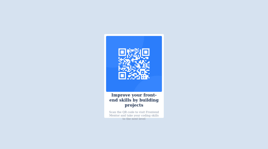
Solution for the qr code component layout with html and css
@IsaacLezama
Design comparison
SolutionDesign
Community feedback
- @0xabdulkhaliqPosted over 1 year ago
Hello there 👋. Congratulations on successfully completing the challenge! 🎉
- I have other recommendations regarding your code that I believe will be of great interest to you.
CSS MEASUREMENTS 📐:
- The
width: 100%property for.containerelement is not necessary. because it's a block level element which will take the full width of the page by default.
- Use
min-height: 100vhfor.containerinstead ofheight: 100vh. Setting theheight: 100vhmay result in the component being cut off on smaller screens.
- For example; if we set
height: 100vhthen the.containerwill have100vhheight no matter what. Even if the content spans more than100vh.
- But if we set
min-height: 100vhthen the.containerwill start at100vh, if the content pushes the.containerbeyond100vhit will continue growing. However if you have content that takes less than100vhit will still take100vhin space.
CSS 🎨:
- Looks like the component has not been centered correctly. So let me explain, How you can easily center the component without using
marginorpadding.
- We don't need to use
marginandpaddingto center the component both horizontally & vertically. Because usingmarginorpaddingwill not dynamical centers our component at all states, Just add the following style rule
.container { justify-content: center; }- Now remove these styles, after removing you can able to see the changes
.card {
   margin: 0 auto;
}
- Now your component has been properly centered
.
I hope you find this helpful 😄 Above all, the solution you submitted is great !
Happy coding!
Marked as helpful0
Please log in to post a comment
Log in with GitHubJoin our Discord community
Join thousands of Frontend Mentor community members taking the challenges, sharing resources, helping each other, and chatting about all things front-end!
Join our Discord
