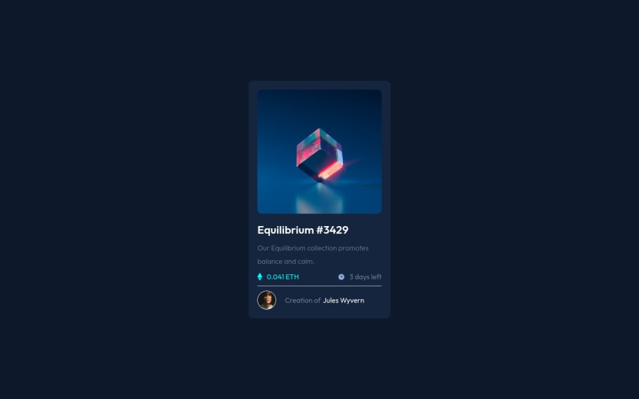
Design comparison
Solution retrospective
Could anyone give me some input on why does the design looks good on desktop, but if you switch to mobile its not aligned? I could not find a way to fix it
Thanks!
Community feedback
- @James-aldersonPosted over 2 years ago
The challenge you designed is great, there are just a few tips that will help improve your design if you follow them:
HTML:
- Adding two meta tags i.e. (author, description), these two tags will help improve the SEO of your design. (optional)
- Import web fonts in the CSS file, not in the HTML file.
- Use semantic HTML tags, in this case it will no longer show accessibility problems in the reports section.
- Use img tag instead of svg content, it's true that using svg content can make a lot of changes, but one of its disadvantages is that it increases the number of HTML lines and makes your code look messy.
- Use the alt feature in img elements, if your design image is not loaded, the alt text will be displayed. Of course, this will make your HTML design no longer have the problem of HTML design in the report section. If you're using an image that doesn't require alt text, for example: the Ethereum icon or the clock icon. In this case, leave the value of the alt attribute empty and use ARIA Roles. Use this line of code: (aria-label="hidden").
- Use h and p elements instead of div element.
- Use the width and height attribute in your img elements, with this you have specified the width and height of your image and improved the SEO of your design.
- For links, use the a element instead of text.
CSS:
- Use custom properties to define color.
- Define the box size value in the margin box.
- Use the grid for the middle of the element. (optional)
- Define the font family in the body element so that you no longer need to define the font family value for each element.
- You can also use the line-height value without the px unit.
- Use a max-width value for your content container, this will help your design to be responsive.
- Use rem or em units instead of px.
- Use transfer. (Optional).
Github:
- Remove the file README-template.md from inside the project files and put it inside the main directory of your project, then edit the information inside it, then change the name of the file README-template.md to README.md. You can visit my GitHub to understand this better.
Don't worry about the large number of tips, you can learn all of them with time and practice. In fact, I have created a fork in your repository where you can see all the tips I mentioned above in your code.
keep practicing and learning 💪 and happy coding 🚀.
Marked as helpful1 - Account deleted
Hey Daniel 👋
This line of code is causing the problem:
height: 100vmin;. Useheight: 100vh;and that should work.Also, your images are not showing. You are missing the dot in front of the slash symbol:
src="/images/image-equilibrium.jpg">. Just add the dot like this:src="./images..."and that's it.I hope this helps.
Happy coding.
2 - @correlucasPosted over 2 years ago
Hello Daniel, congratulations for your solution.
Answering your question, as Nikola said your solution isn't centered because your code has ome character error with the
body { height: 100vh;}the mobile version has some issues due to the fixed values your set for the width try to usemax-widthto keep your container card flexible in smaller screens, check also if you don't set fixed with for the image, because if you do rhe image will pop out from the container due the fact it cannot change size since isnt flexible.I hope it help you and write us to say if the tips help you to fix the solution. Happy coding Daniel! ✌️
1 - @evandromarisPosted over 2 years ago
Try using 100vh in the height property of your body, that way you use 100% of the viewport, in this case as it's an NFT the size of a cell phone, it can be an alternative and simple fix.
body { ... height: 100vh; ... }
Hope this helps :)
In addition to this fix, you can check your code report here on Frontend Mentor, so you can always improve accessibility and HTML code.
https://www.frontendmentor.io/solutions/solution-for-the-nft-card-project-Z6cf2CD6Ti/report
1 - @James-aldersonPosted about 2 years ago
Hi Daniel Ayala
Unfortunately after making changes to your challenge, I forgot to create a pull request so that you can apply those changes to your challenge. I'm sorry about that
I have created a pull request in your repository, you can review the changes and add the changes to your design.
0
Please log in to post a comment
Log in with GitHubJoin our Discord community
Join thousands of Frontend Mentor community members taking the challenges, sharing resources, helping each other, and chatting about all things front-end!
Join our Discord
