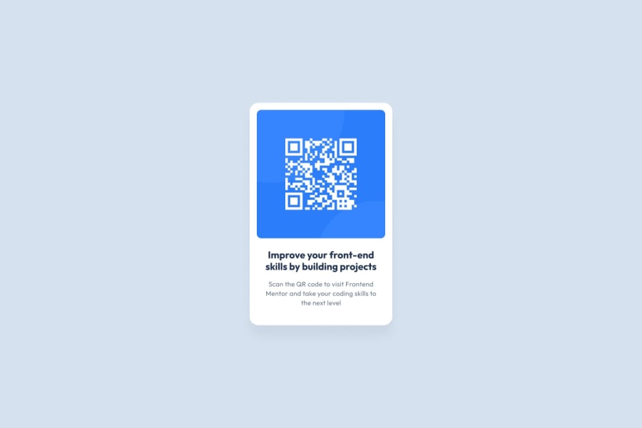
Design comparison
Solution retrospective
About the colors used in this project. I applied the color "light gray" to the text "Scan the QR code to visit Frontend Mentor and take your coding skills to the next level" and it was very faded in relation to the background color of the card. So I had to use a darker shade of gray. What do you think about this, was this shade of gray the right one and was I doing something wrong about applying it?
Community feedback
- @Mercury225Posted 10 months ago
Hi there, Great job! I'm having a look at your code and there are some things that stick out to me:
In index.html you write your CSS in your html
-It's common practice to put this code in another CSS file (call it maybe styles.css) and to put a HTML link tag to the CSS file.
- margin: 50px auto 0; is better
-Using px is fine, but for responsive design purposes, it's usually a better habit to use the unit rem, or em, to make it easier for resizing for bigger projects
And about the shades of grey, the darker background grey looks a bit sinister, i would stick with a lighter shade
Hope this helps!
Marked as helpful2@devid8642Posted 10 months ago@Mercury225 Thank you very much for the tips! Regarding CSS in HTML, I chose to do it this way because it was a simple case of styling just one page. However, I will try to follow good practices from now on.
I didn't know about this good practice of relative length units (em, rem). I will research more about it and see how I can apply it to my projects.
Regarding the issue of colors, I believed that I should use the colors exactly as they are defined in style-guide.md. But I see that there is complete freedom to make adaptations without going much beyond the original color palette.
Again, thank you for your help and your time.
0 - @danielmrz-devPosted 10 months ago
Hello @devid8642!
Your solution looks excelent!
I have just one suggestion:
📌 In order to make your HTML code more semantic, use
<h1>for the main title instead of<p>.Unlike what most people think, it's not just about the size and weight of the text.
-
The
<h1>to<h6>tags are used to define HTML headings. -
<h1>defines the most important heading. -
<h6>defines the least important heading. -
Only use one
<h1>per page - this should represent the main heading/title for the whole page. And don't skip heading levels - start with<h1>, then use<h2>, and so on.
All these tag changes may have little or any visual impact but they make your HTML code more semantic and improve SEO optimization as well as the accessibility of your project.
I hope it helps!
Other than that, great job!
Marked as helpful1@devid8642Posted 10 months ago@danielmrz-dev Hello, thank you very much for these tips. In fact I didn't use heading tags, I should correct this small error soon and be careful in future projects.
Regarding the issue of using only one heading level per page. I was recently informed, without a clear reference, that currently you can use more than one h1, h2 etc. per page as long as they are in different sections.
This would now be possible as SEO engines would have adapted to this. As I don't have any reliable reference that points this out, I leave my question to you and the community as well: Does anyone know anything about this?
1@danielmrz-devPosted 10 months ago@devid8642
I use W3C as reference, and they still recommend using only one per page.
I'm gonna keep checking to see if anything changes 😁
1 -
Please log in to post a comment
Log in with GitHubJoin our Discord community
Join thousands of Frontend Mentor community members taking the challenges, sharing resources, helping each other, and chatting about all things front-end!
Join our Discord
