Design comparison
SolutionDesign
Solution retrospective
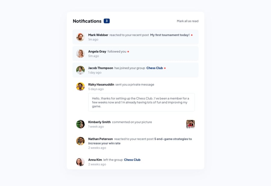
Took more of a styling cue from the more recent social media links card challenge and added a mock navbar header. Formatted the notifications into a json file and rendered the items via JS and some html templating that I tried to keep as clean as possible but with added skeleton loader fx and unread notification styling it got a little ugly in the one function. Feedback and suggestions welcomed!
Community feedback
Please log in to post a comment
Log in with GitHubJoin our Discord community
Join thousands of Frontend Mentor community members taking the challenges, sharing resources, helping each other, and chatting about all things front-end!
Join our Discord
