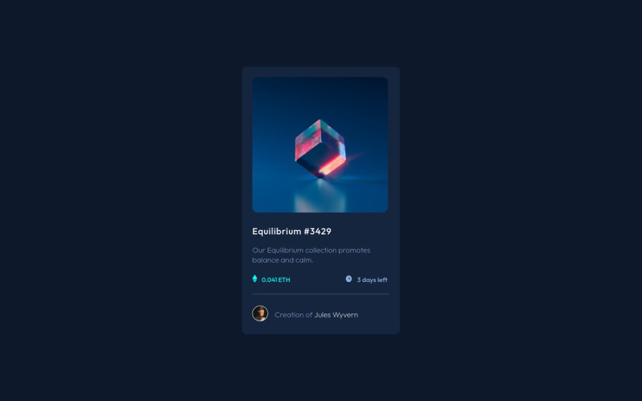
Design comparison
Solution retrospective
This is my solution for this exercise, am open to corrections, or any form of observations from the community
Community feedback
- Account deleted
HI @iamenochlee your solution look identical to the design , my only observaton is instead of using multiple
padding-topu could usedisplay:grid; & gapto creat equal vertical spacing between elements in the.collection-container.collection-container { display: grid; gap: 1em; }and remove allmargin-toppropertiesfor more info click this
this will save a lot of time
Marked as helpful0 - @correlucasPosted over 2 years ago
👾Hello Enochlee, congratulations for your new solution!
I've some tips to fix the container and image responsiveness
Replace
width: 324px;withmax-width: 324px;to make the container contract while scaling now thats responsive:.collection-container { max-width: 324px; height: 540px; position: absolute; top: 50%; left: 50%; transform: translate(-50%, -50%); background-color: var(--card-bg-color); border-radius: 10px; color: var(--color-text); padding: 23px; }Make the image super responsive using
display: blockandmax-width: 100%andobject-fit: coverto make it crop while scaling:.collection-container .nft { object-fit: cover; display: block; max-width: 100%; border-radius: 10px; /* width: 277px; */ /* height: 277px;*/ cursor: pointer; transition: hover 0.3s; }👋 I hope this helps you and happy coding!
0
Please log in to post a comment
Log in with GitHubJoin our Discord community
Join thousands of Frontend Mentor community members taking the challenges, sharing resources, helping each other, and chatting about all things front-end!
Join our Discord
