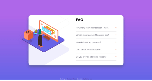
solution for FAQ-accordion-card challenge using html/css/js
Design comparison
Solution retrospective
Any feedback would be appreciated :) .... The only thing I didn't manage to get right was the "illustration-woman-online-desktop" image, I couldn't get it to cut off on the left side like the desktop design showed I'd love to get some help on that matter thanks.
Community feedback
- @fidellimPosted about 3 years ago
Hi Yousef,
I tried to play a bit with your code and in order to answer your question, you should include the "image-section-desktop" div inside "content-section" div. Then, transfer this code to "image-section-desktop":
position: absolute; transform: translate(-15%, -120%); width: 400px; height: 305px;
After that, include this in "content-section" div:
position: relative; overflow: hidden;
What overflow hidden will do is that it will not allow overlapping of "image-section-desktop" div. Which solves your question.
I hope it helps. You can also read your report so that you have an idea of ways to fix some issues that occurred to your project. Great work anyways for implementing the design for both mobile and desktop views.
Marked as helpful0@YousefKhalid-iqPosted about 3 years ago@fidellim Thanks a lot for the feedback, it now looks perfect :)
1@fidellimPosted about 3 years ago@YousefKhalid-iq that's great! Good luck with your future projects! Keep it up :)
0
Please log in to post a comment
Log in with GitHubJoin our Discord community
Join thousands of Frontend Mentor community members taking the challenges, sharing resources, helping each other, and chatting about all things front-end!
Join our Discord