Solution for "easybank-landing-page" challenge using html/css/js

Solution retrospective
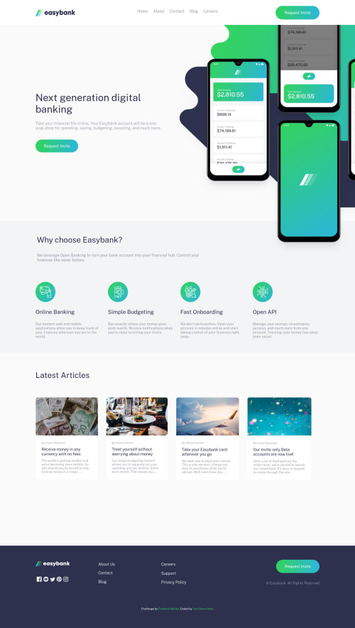
Hey there, So I tried many different ways to push a part of the mockups image outside the screen in the desktop version but I didn't get it right so i just made another copy of the image and cut a bit of it. What I really struggled to do since I'm new to JS is that when I open the nav-bar menu on the mobile version the whole page becomes darker but if leave the nav-bar open and expand the screen size the effect stays even in the desktop version and it gets stuck there because the nav-button is no longer there, is there a way to remove the effect after i get the width of the screen to 1024px and above? if so I would really appreciate any tips on that matter. Thanks for stopping by and have a good day :)
Please log in to post a comment
Log in with GitHubCommunity feedback
No feedback yet. Be the first to give feedback on Yousef Khalid's solution.
Join our Discord community
Join thousands of Frontend Mentor community members taking the challenges, sharing resources, helping each other, and chatting about all things front-end!
Join our Discord