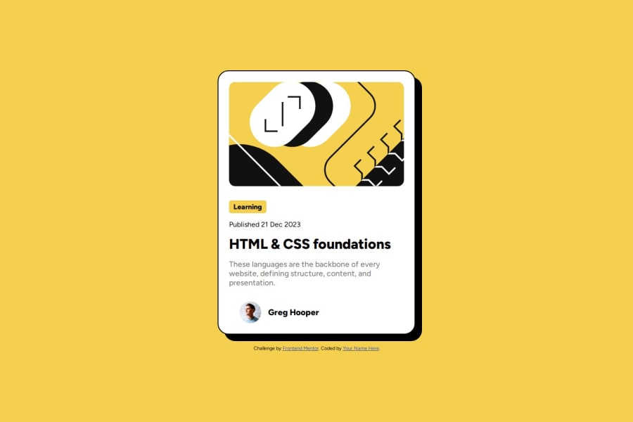
Design comparison
Solution retrospective
I'd like that this was an easy one for me to figure out after coming back from not coding for a few months it was good to get back in the saddle of coding.
Next time I'd try to get as close to pixel perfect to the design as possible as I feel its not 100% of the way there. I did this one months ago so this is a re-submital. You can view my older submission here as well.
https://65ada36a93d77db1e9eb0018--chipper-frangipane-4ace1d.netlify.app/
What challenges did you encounter, and how did you overcome them?The box shadow I used chatgpt to assist, but even that did not work original output was
box-shadow: 0 4px 16px rgba(0, 0, 0, 0.2); /* Adjusted box shadow */
I ended up changing to 15px 15px and rgba(0,0,0,1) and worked.
What specific areas of your project would you like help with?How to get it more pixel perfect of the design to match.
Community feedback
- @gfunk77Posted 10 months ago
Nice job on your solution. I would suggest a few things:
- You have many nested sections. A section is a section of the overall page, not really divisions of an item. So I think in your case, should could use a section for your card and then within that one section use divs.
- You have your css file in the assets folder. Consider just using assets for pictures and stuff and place your css in its own directory. This project is pretty small so it could just be a file in the root.
- try to avoid using fixed widths, like on your card. Consider max-width instead. This will be better for responsiveness. Also use min-height: 100vh instead of just height. That will work better for small screens.
- Did you add the font from the style guide? I couldn’t quite tell because I am viewing from my phone but you can grab this from Google fonts and add it to your html in a link or your css with an import.
I hope this helps. Congrats on your solution.
Marked as helpful1 - @danielmrz-devPosted 10 months ago
Hello @JoeWebDevelopment!
Your solution looks excellent!
I have just one suggestion:
- Use
<main>
to wrap the main content instead of<main>
and<section>
.
📌 The tag
<section>
would make more sense if the card was part of a bigger website (in certainly would in real world), but here it is all we have on the screen.This tag change does not impact your project visually and makes your HTML code more semantic, improving SEO optimization as well as the accessibility of your project.
I hope it helps!
Other than that, great job!
1 - Use
Please log in to post a comment
Log in with GitHubJoin our Discord community
Join thousands of Frontend Mentor community members taking the challenges, sharing resources, helping each other, and chatting about all things front-end!
Join our Discord