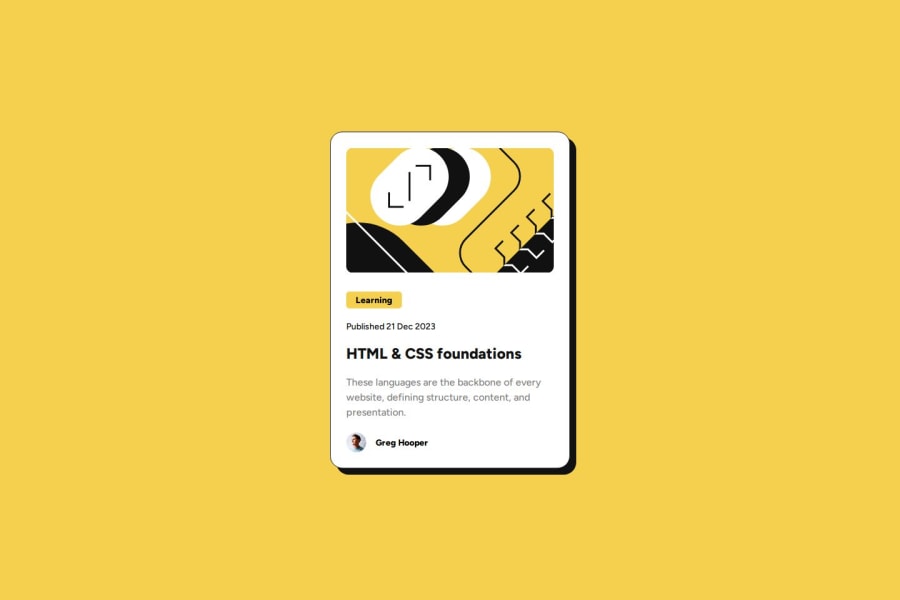
Design comparison
SolutionDesign
Solution retrospective
What are you most proud of, and what would you do differently next time?
I used more display flex this time and using gap instead of adding padding for each element. Would like to use scss and use it for nesting to make my css even cleaner. Might use classes more instead of id's to get used to it for bigger projects with repetetive content.
What challenges did you encounter, and how did you overcome them?Had some trouble using the svg but eventually I put it in an img tag so I could better scale it for mobile
What specific areas of your project would you like help with?Happy with how the project developed so no help needed
Please log in to post a comment
Log in with GitHubCommunity feedback
- @AlyaaRushdy
It looks amazing!
Join our Discord community
Join thousands of Frontend Mentor community members taking the challenges, sharing resources, helping each other, and chatting about all things front-end!
Join our Discord
