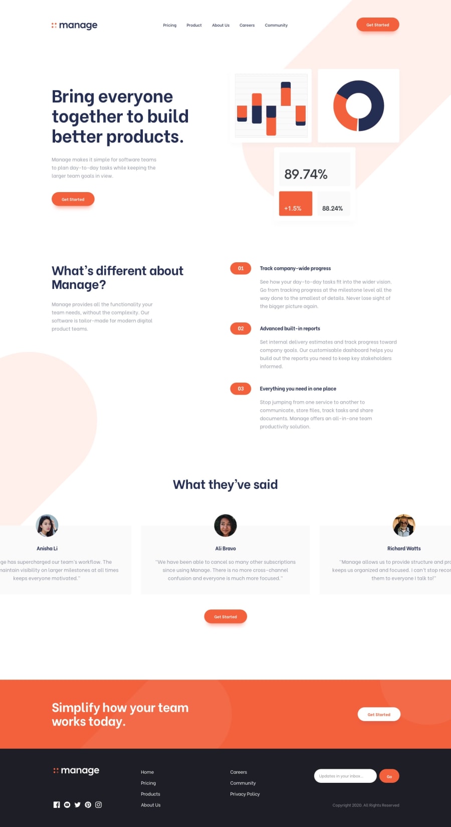
Solution created with Sass and has a working slideshow on Mobile
Design comparison
Solution retrospective
I have a question about the slider part of the landing page. For the Mobile version i used for the slider-container a width of 400% and for every slide a width of 25%, so that there is always only one slide visible on the page. For the Desktop version i didn't know if the slider should be interactive, so i designed it just like it looks on the design-image. Now i used for the slider-container a width of 157% to make three slides visible on the page. And then I tweaked the slider-container with translateX to center the second slide somehow on the middle of the page. So my question is, if there is a better way to handle this, maybe to somehow calculate it to get exactly the center of the page.
Is there a way to align svg images to baseline, its especially noticable that they are not straight on the desktop version of the page.
Is the font-family really 'Be Vietnam Pro' some letters look different on the design-images like the small g.
Community feedback
Please log in to post a comment
Log in with GitHubJoin our Discord community
Join thousands of Frontend Mentor community members taking the challenges, sharing resources, helping each other, and chatting about all things front-end!
Join our Discord
