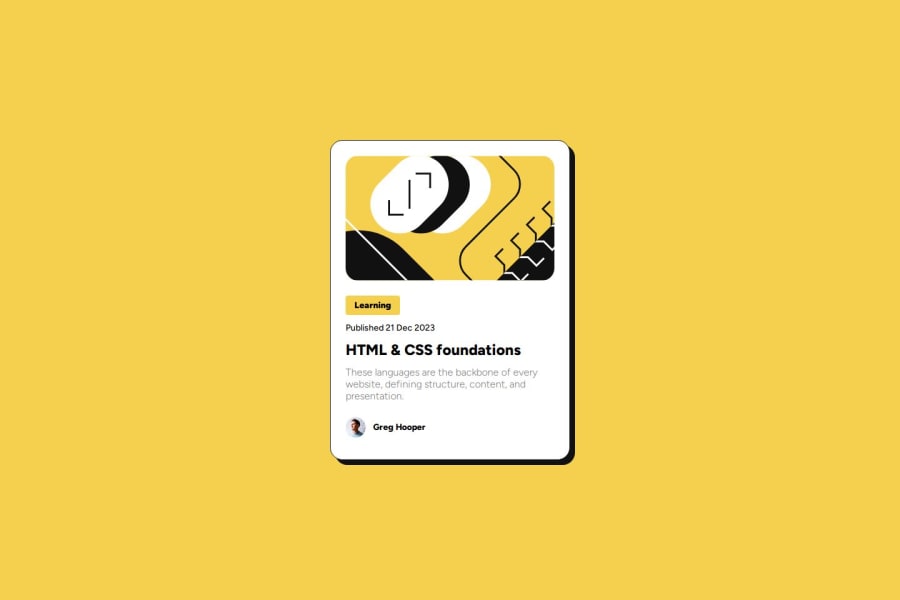
Design comparison
Solution retrospective
I'm proud to finded the method to make all my page with the 100% height. Because I wanted to have the card in the middle of the page easier.
What challenges did you encounter, and how did you overcome them?I find use the Figma conception it's difficult. It's not easy for me to find the good size for the text or padding size. I prefer use my eye to adapt a little the size.
I used to work on Title of the category. beacause i don't know why the display:inline wasn't working.
What specific areas of your project would you like help with?I would like some advice to the conception oh the HTML. I used a lot's of class, to designate clearly the different element . But I not sure it was a good practice.
If you have some advice to adapt easier the size of my different element (text, padding).
And I don't found how can I change the style of my cursor in black color.
Community feedback
- P@itsmesrishtiPosted 9 months ago
Hey, straight off the bat it's amazing how close you got to the design! Flexbox is the best for centering isn't it?!
After reviewing your code there is something interesting I learned from it like using <article> for blog preview card. I'd have never thought of using it for this purpose so thank you for making me think! And you are right of course <article> can be used this way.
You might want to consider the order of heading tags. <h1> should be the first heading tag and I guess for the learning label you could use something like span.
And as for your doubt regarding class names, for such small projects you can avoid giving a class name to everything. You can avoid giving a class name to <h1> because a page is only supposed to have one <h1> so just target h1 directly.
You could target h2 tags in the project without using class names as both the tags are present in different sections so just use class name of section followed by h2 (eg: .article_information h2). Again since this is a small project this h2 thing can work but maybe for bigger projects it might be better to assign a class name (like you did) to the learning tag so that if you create same style of tag somewhere else in the project for some other purpose.. you'd be able to reuse the style assigned to it. I hope that makes sense!
Again amazing work! You got so close to the design! And also thank you for teaching me something!
1@CecDorWEBPosted 9 months ago@itsmesrishti Oh thanks you very much to took time to watch my code !
Your response is very interessant, I understand what you mean about titles. So I need to start with a h1. And here I don't need to use an h2, just a span it's ok.
And thanks for the explanation abour class name. I understand that if it's a small project I should keep it simple. Simply use class names if there is a risk of conflicting whit another part of the html code.
1
Please log in to post a comment
Log in with GitHubJoin our Discord community
Join thousands of Frontend Mentor community members taking the challenges, sharing resources, helping each other, and chatting about all things front-end!
Join our Discord
