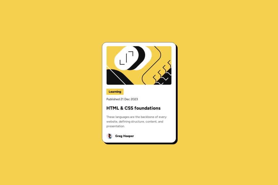
Design comparison
SolutionDesign
Community feedback
- @StroudyPosted 3 months ago
Hey, Great job with this solution you should be proud, A few things I noticed,
- Missing a
<meta>description tag for SEO purposes, - Your heading elements are not in a sequentially-descending order,
<h2>``<h4>``<h2>, Should be<h1>``<h2>``<h3>``<h4>, You can have multiple<h2>but they have to be in order, Properly ordered headings that do not skip levels convey the semantic structure of the page, making it easier to navigate and understand when using assistive technologies. - You should avoid using
pxas it is an absolute unit and not a responsive unit likeremorem, You should look at this article from a Frontend mentor dev, Why font-size must NEVER be in pixels.
I Love that you used a full modern reset, You have done so much correctly with this solution, I hope you found some of this information helpful, You should give the articles a good read and I look forward to seeing some more from you, Happy coding! 💻
Marked as helpful1@romannstPosted 3 months ago@Stroudy Thx man! You're right, i will put the meta description tag and change the px and heading thing.
1@StroudyPosted 3 months ago@romannst, No problem at all, You did so much right with this was hard for me to find any improvements, I hope to see more from you!
1 - Missing a
Please log in to post a comment
Log in with GitHubJoin our Discord community
Join thousands of Frontend Mentor community members taking the challenges, sharing resources, helping each other, and chatting about all things front-end!
Join our Discord
