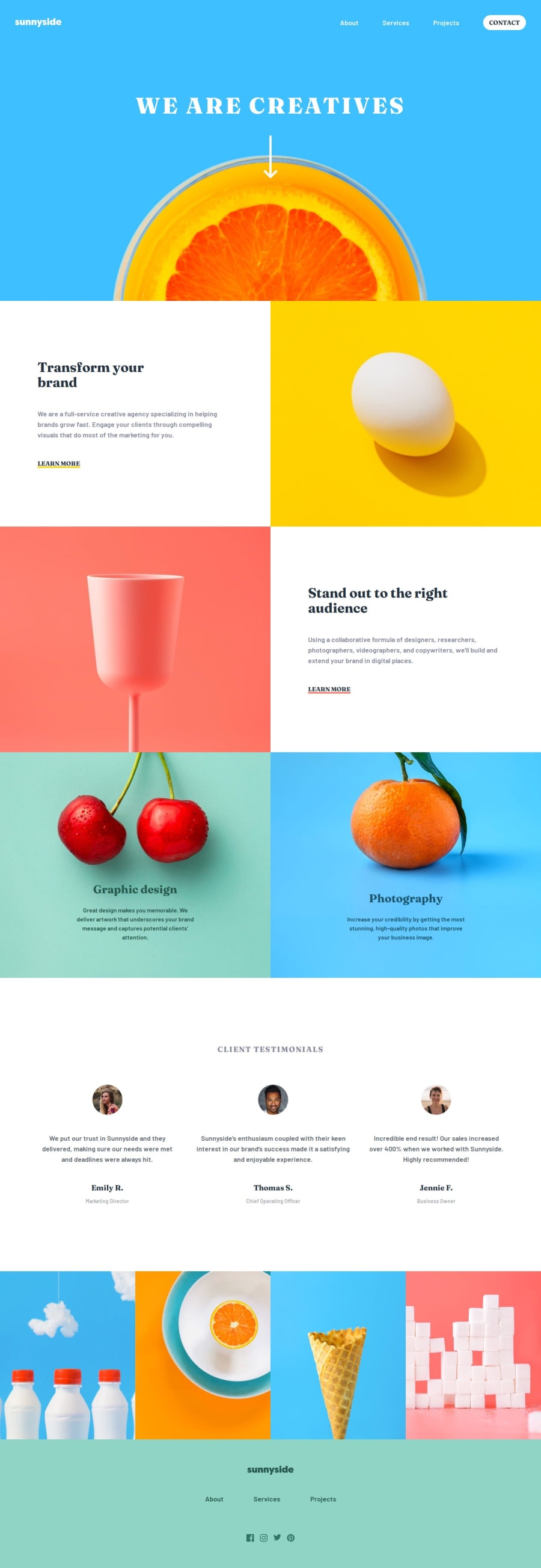


Design comparison

Community feedback
- @GADMuhammadPosted about 2 months ago
1- Make the header sticky >> to facilitate navigation on the page
2- In the footer, do not let the href of <a> tag empty. put your own to facilitate communication with you
3- Reduce some padding in the testimonial section. It is huge.
Marked as helpful1@xStephxPosted about 2 months ago@GADMuhammad thank you so much for feedback! I will improve that advises in code asap. If you have any other suggestion feel free to text me.
0 - @R3ygoskiPosted 2 months ago
Hello Stefan, congratulations on completing this challenge, it turned out very well.
I’d like to offer some suggestions to help with a small bug I noticed and also propose adding a new feature. First, let’s address the bug I observed.
When we open the Menu in Mobile mode, the Title and the Down Arrow image are pushed by the Menu. I’m not sure if this was intentional or not. If it was, please disregard this section, but if not, you might consider changing it as follows:
For the arrow image (Arrow Down), you might consider adding the following classes:
absolute top-72 left-1/2 -translate-x-1/2. This will position the image absolutely, placing it on a "new plane" and preventing the menu from pushing it.For the Title (h1), you might consider adding the following classes:
absolute top-24 w-full md:static. This will achieve the same effect as described above.Finally, for the menu (
div#hamburger-menu), you might consider adding the following class:z-10. This will make this element appear on a plane above the Title and Arrow Image, ensuring they stay behind the menu instead of in front of it.Now, regarding the suggestion for a new feature, I believe it would be interesting if clicking on the arrow directed us downward, taking us to the site’s initial section. Here’s something to help you implement this:
First, place the Down Arrow Image inside an
<a>tag, like this:<a href="#first-section"> <img src="assets/images/icon-arrow-down.svg" alt="Arrow Down Icon" class="flex pt-24 mx-auto absolute top-72 left-1/2 -translate-x-1/2" /> </a>In the first section, the one with the egg, you need to add an ID so that the
<a>tag can reference it via thehref. It would look like this:<section id="first-section" class="flex md:flex-row flex-col w-full"> <!-- Rest of the HTML --> </section>To make the transition smooth, we can add the following class to the
<html>tag:scroll-smooth. This will make the scrolling smooth. If it doesn’t work, it might be because the browser doesn’t support this functionality or it’s disabled.A small suggestion:
altattribute texts should be more descriptive, and we shouldn’t usealttexts for icons. For icons, we use thealttext like this:alt="". This also applies to background images. For images, when usingbackground-image, consider adding anaria-labelto provide a description, allowing visually impaired individuals to know what’s in the image. Example of usingaria-label:<div class="bg-section-1-mobile..." aria-label="An egg on a yellow background"></div>That’s it! Once again, congratulations your project turned out very well and is semantically good. If you have any questions, please comment below, and I’ll try to help as best I can.
Marked as helpful1@xStephxPosted 2 months ago@R3ygoski thank you so much for your feedback! I read all suggestions, and they give me some ideas to fix and improve to better code. I will fix it and add new features to project. If you have any other suggestions, feel free to text me!
1 - @aslinsjrPosted about 2 months ago
Nice work!
1


Please log in to post a comment
Log in with GitHub
Join our Discord community
Join thousands of Frontend Mentor community members taking the challenges, sharing resources, helping each other, and chatting about all things front-end!
Join our Discord