Design comparison
SolutionDesign
Solution retrospective
i want your opinions
Community feedback
- @pikapikamartPosted about 3 years ago
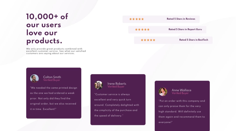
Hey, awesome work on this one. Layout looks fine in desktop, I like the way the ratings are placed in the responsive state, the mobile layout looks great.
Some suggestions would be:
- For this one, I would wrap the whole content in a
mainelement, since there aren't any content to be used by theheadertag on this one, I wouldn't useheaderbut keep thefooterfor the attribution:
<main /> <footer />- For the ratings, you don't need to use
navelement.navelement is used to wrap navigational links, links that your website primary used. Since there are no links being used, you don't neednav. - The
altvalues for each of the image on the testimonial section should use their names likealt="Colton Smith", the name are already present so using it would be great. - The name of the person and their position could only have used a single heading tag. Also, when using heading tags, make sure you are using it incrementally by 1. If you use
h3, make sure thath1, h2are present before it.
Aside from those, site looks really great.
0@ouuoussamaPosted about 3 years ago@pikamart Thank you for sharing your advice with me
0 - For this one, I would wrap the whole content in a
- @CesarGMEFAPosted about 3 years ago
You could accommodate the paragraphs of the buyers' comments, putting a (font-size: 15px;) and (line-height: 21px;) and in the list of styles it says that the font size should be 15px.
0
Please log in to post a comment
Log in with GitHubJoin our Discord community
Join thousands of Frontend Mentor community members taking the challenges, sharing resources, helping each other, and chatting about all things front-end!
Join our Discord
