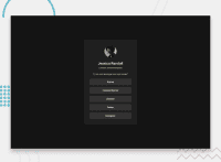
Design comparison
Solution retrospective
Me orgulho do meu CSS, por que mesmo que eu sei só o basico dele eu já consigo fazer alguma coisa, mas ainda sim preciso melhorar muito, não só o CSS mas sim também o HTML, aprender a otimizar mais eles.
What challenges did you encounter, and how did you overcome them?O meu maior desafio foi centralizar as divs e separar elas
What specific areas of your project would you like help with?Eu gostaria de ajuda em aprender a otimizar mais o meu CSS e ajeitar as minhas divs
Community feedback
- @LuisVera1Posted 7 months ago
**Hi GeovannaV **
Your solution looks great! However, to improve the semantics of your HTML, here are some suggestions.
--- Use the appropriate HTML element
- Use the
<main>to wrap all the content instead of a<div>element - Use
<a>for links - All content must be in an html element, for example, the text
London, United Kingdomcould be in a<p>
--- Css
- Your css file looks good, but I recommend using padding in your
.box, instead of using margin in elements, it is easy to work with padding
Check out the following link: Social-links and then basic
Hope this is helpful, if it is, don't forget to mark it, thank you
Keep up the good work!
0 - Use the
Please log in to post a comment
Log in with GitHubJoin our Discord community
Join thousands of Frontend Mentor community members taking the challenges, sharing resources, helping each other, and chatting about all things front-end!
Join our Discord

