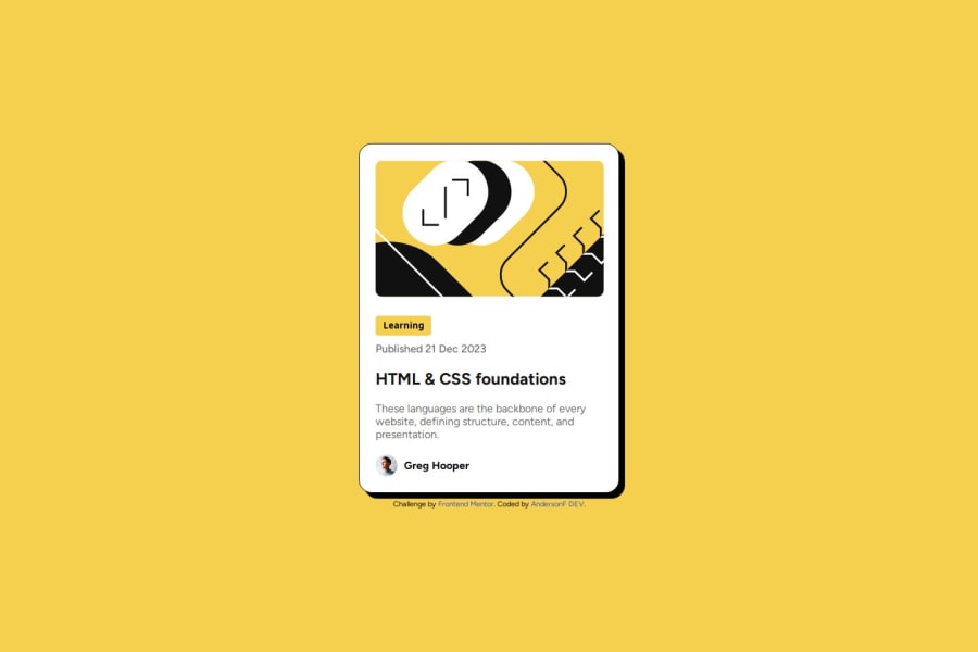


Design comparison
SolutionDesign

Solution retrospective
What are you most proud of, and what would you do differently next time?
Cada vez mais estou aprendendo com estes projetos tenho que melhorar nos nomes das class e reduzir o código do CSS.
What challenges did you encounter, and how did you overcome them?Um dos maiores desafios e escrever nomes de class que sejam bons e tentar reduzir. Au máximo a quantidade de código escrito. Continuo tentando melhorar muito neste ponto.
What specific areas of your project would you like help with?Como escrever nomes de class que fazem sentidos e reduzir Au máximo o código do CSS
Community feedback
- @willprincePosted 7 months ago
Great job! You nailed it!
I see 3 points of improvment.
- Fonts were giving available locally so you did not have to import via url. So if google font goes down, your font will still work.
- You do not need to set image width for the card image simply make it fit. img{ width: 100%; height: 100%; object-fit: cover; }
- Your typography is not responsive, since its the same on desktop and mobile. For font size you can use clamp(min, variableSize, max) to let the size adjust its self to the screen width.
Good job!
Marked as helpful0

Please log in to post a comment
Log in with GitHub
Join our Discord community
Join thousands of Frontend Mentor community members taking the challenges, sharing resources, helping each other, and chatting about all things front-end!
Join our Discord