Submitted 6 months ago
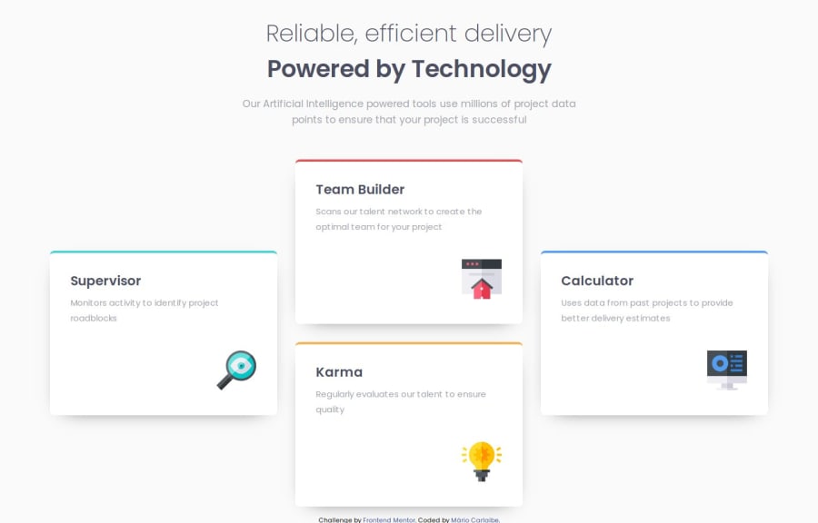
Solução de seção de recursos de quatro cartas usando Flexbox e Grid
@MarioCarlaibe
Design comparison
SolutionDesign
Solution retrospective
What are you most proud of, and what would you do differently next time?
de ter usado o first mobile e tbm o flex grid.
What challenges did you encounter, and how did you overcome them?até eu ter terminado o mobile first, foi trankilo. Mas depois adaptar para a versão desktop onde eu tive que usar o flex grid, ai o trem ficou feio kkkk
What specific areas of your project would you like help with?to safe
Please log in to post a comment
Log in with GitHubCommunity feedback
No feedback yet. Be the first to give feedback on MARIO CARLAIBE DE ANDRADE's solution.
Join our Discord community
Join thousands of Frontend Mentor community members taking the challenges, sharing resources, helping each other, and chatting about all things front-end!
Join our Discord
