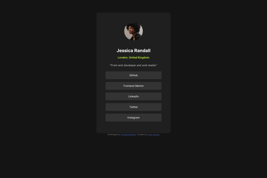
Design comparison
SolutionDesign
Community feedback
- @pblanabellePosted about 1 year ago
Hello. This looks great. Although maybe we can put some margin on top ( .card { margin-top: 30px; } // please adjust it depends on how much needed.) so that your card will be adjusted a little. But you can try to manipulate the gridding also. I hope it helps.
0
Please log in to post a comment
Log in with GitHubJoin our Discord community
Join thousands of Frontend Mentor community members taking the challenges, sharing resources, helping each other, and chatting about all things front-end!
Join our Discord
