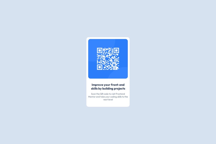


Design comparison

Community feedback
- @theJRodriguesPosted about 2 months ago
Um bom trabalho, porém eu mudaria algumas coisas por questões de responsividade.
HTML Em html eu apenas adicionaria o atributo alt na tag imagem, por conta de acessibilidade, e utilizaria a tag article para fazer o container do card e utilizando a tag figure para a imagem, ao invés de divs, fazendo mais sentido em questões de semântica.
CSS Utilizaria a seguinte estilização para o card e a imgem do QR Code. Na classe .qrCard eu utilizaria um width de 100% para ficar responsivo com o redimensionamento da tela e utilizaria o max-width para limitar o tamanho. Com isso não é necessário o display grid para controlar o tamanho da imagem, pois a imagem redimensionará junto com a largura do card.
Seu código
.qrCard{ background-color: white; width: 18rem; height: 29rem; display: grid; grid-template-rows: 60% 40%; justify-content: center; align-items: center; text-align: center; border-radius: 15px; padding: 12px; } .imagen{ display: flex; justify-content: center; width: 100%; height: 100%; margin: 0; } .imgQr{ margin: 0; height: 100%; max-width: 100%; border-radius: 15px; }Como eu faria
.qrCard{ background-color: white; width: 100%; max-width: 18rem; display: flex; flex-direction: column; align-items: center; text-align: center; border-radius: 15px; padding: 12px; } .imagen{ width: 100%; } .imgQr{ width: 100%; }Não foi necessário usar height na classe .qrCard pois a altura se adequará ao conteudo.
Espero ter ajudado!!
Marked as helpful0


Please log in to post a comment
Log in with GitHub
Join our Discord community
Join thousands of Frontend Mentor community members taking the challenges, sharing resources, helping each other, and chatting about all things front-end!
Join our Discord