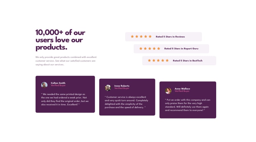
Design comparison
Solution retrospective
Is this good enough ?
Any feedback are always welcome !
Community feedback
- @correlucasPosted over 2 years ago
👾Hello Soytto, congratulations for your new solution!
Your solution seems perfect. The only thing you've missed is the two svg images as background the one in the top and bottom.
To add the two
wavesvg background images in the (top/bottom),, the best way is by usingbackground-imageto manage it since adding them to thebodyyou make sure it will be under everything, to manage different images inside a single css property asbackground-imageyou use the comma inside each properties declare the single modification for each circle separated. See the code below to see your solution with those backgrounds applied:body { background-image: url(../images/bg-pattern-top-desktop.svg), url(../images/bg-pattern-bottom-desktop.svg); background-position: left -185px top -236px, right 10px bottom -300px; background-repeat: no-repeat, no-repeat; background-attachment: fixed, fixed; background-size: contain, contain; font-family: 'League Spartan', sans-serif; font-size: 15px; display: flex; justify-content: center; align-items: center; min-height: 100vh; }👾My rating for this solution: ⭐⭐⭐⭐⭐
✌️ I hope this helps you and happy coding!
Marked as helpful0@SoyttoPosted over 2 years ago@correlucas I didn't notice at all that there was a background :O
I just fixed it ! thanks !
And thank you for your feedback and explanation, I really appreciate !!
1
Please log in to post a comment
Log in with GitHubJoin our Discord community
Join thousands of Frontend Mentor community members taking the challenges, sharing resources, helping each other, and chatting about all things front-end!
Join our Discord
