

Design comparison

Solution retrospective
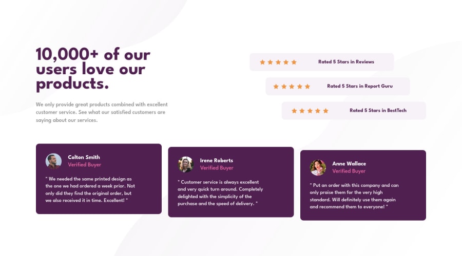
how can i sit background imgs better? **how can i make this project with best practice ? ** I am still learning ..all feedback is welcome
Please log in to post a comment
Log in with GitHubCommunity feedback
- @sarvothamgowda
Hey, good job!
Especially on aligning the testimonial cards as per the design. The only thing where you can work on is the background image position. Here is my solution.
- mobile version:
body { background: url(./images/bg-pattern-bottom-mobile.svg) no-repeat fixed bottom right, url(./images/bg-pattern-top-mobile.svg) fixed no-repeat top left; }- desktop version:
body { background: url(./images/bg-pattern-bottom-desktop.svg) no-repeat fixed bottom right, url(./images/bg-pattern-top-desktop.svg) no-repeat fixed top left; }Marked as helpful - @correlucas
👾Hello ABDELRAHMAN KHALED, congratulations for your new solution!
Your solution is just amazing, the only thing you need to fix is the top and bottom background positions. You can give the background a better position to the body with these properties:
body {
    display: flex;
    background-color: var(--bg);
    background-image: url(images/bg-pattern-top-desktop.svg), url(images/bg-pattern-bottom-desktop.svg);
    background-position: left -185px top -236px, right 10px bottom -300px;
    background-repeat: no-repeat, no-repeat;
    background-attachment: fixed, fixed;
    background-size: contain, contain;
    justify-content: center;
}
👋 I hope this helps you and happy coding!


Join our Discord community
Join thousands of Frontend Mentor community members taking the challenges, sharing resources, helping each other, and chatting about all things front-end!
Join our Discord