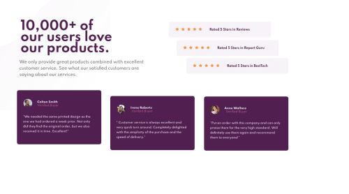
Social-proof-section with Using some animation for Desktop and mobile
Design comparison
Solution retrospective
I am very excited to see your feedback about my project and what do you think about this animation
Community feedback
- @pikapikamartPosted over 3 years ago
Hey, great work on this one. That animation start is awesome.
The layout in desktop is good but it seems that it is a bit onto the left, don't you think.
A couple of suggestions;
1 . Overflow. Opening up dev tools, your layout is cannot be scroll. Then I looked at your css and saw that you declared
overflow-y: hidden
and this what causes for your layout not be scrollable. Removing this will be awesome. Take note of the huge white section in the bottom when you remove it.-
Resizing. When I resize, the viewport now hides the layout thus creating a scrollbar at the bottom which we really do not want. Making a custom layout on those breakpoint will be really good so that you could avoid those effects.
-
Mobile State. Upon reaching the mobile state, there is a scrollbar at the bottom and the layout is not properly centered which I think it is supposed to?
3.1. To fix the scrollbar at the mobile state, simple remove the
width: 93%;
declaration in yourtopcontainer
selector. Then maybe addingtext-align: center
if the layout needs the text to be centered.3.2. Your
botcontainer
elements is really not being captured that well by the parent. Removing theheight
position
andbottom
in yourbotcontainer
will be really good since if you inspect it, the positioning of that selector, thebotcontainer
without those properties, is properly in the flow of the whole layout. Removing also theposition
top
of thecard1
andcard2
in the mobile state will be good. Since you can achieve those without that property. Using just padding for thebotcontainer
andmargin
for the card nested inside it.3.3. The
card3
needs to be adjusted as well.if you need help regarding those what I mentioned, just drop your query in here okay^^
1@Muhammad-samirPosted over 3 years ago@pikamart Thank you for your advice and I am going to make these changes and reuploade it again
0 -
- @palgrammingPosted over 3 years ago
The animation was a nice surprise maybe a little fast but nice take on the project. The sizes of the content/elements at 375px width are not correct and need a little fine tuning
0@Muhammad-samirPosted over 3 years ago@palgramming Thank you for your feedback and i've made it correct now go and see it
0
Please log in to post a comment
Log in with GitHubJoin our Discord community
Join thousands of Frontend Mentor community members taking the challenges, sharing resources, helping each other, and chatting about all things front-end!
Join our Discord