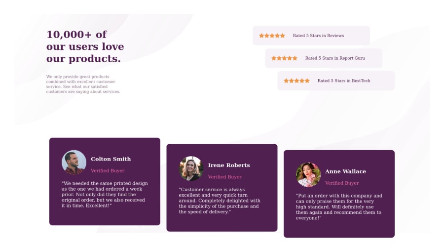


Design comparison
SolutionDesign

Solution retrospective
I tried to implement this challenge using flexbox, but couldn't succeed. Is it a right approach to use flexbox or can we use css grid layout.
Please log in to post a comment
Log in with GitHubCommunity feedback
- @pikapikamart
hey, your work there is great just some touches so that will be closer to the original. Pointing to your question
- There is no right approach to layout between grid and flexbox. If you want something that scale easily, go with flexbox, but if there are more complex multiple layout you could do grid.
- May I suggest, for your cards, instead of doing
flex: 1 0 200px, maybe try usingflex: 0 1 100%, that way you three cards will be at same sizes according to the space of the parent container, but if you uses make sure your parentflex-wrap: wrapis not already toggled on since it will make each child on its own row. Then just useflex-wrap: wrapin your desired media query resolution. - Just a suggestion, don't make the body
height: 100%since it will only to the viewport's height, and will cut off the size of everything below it. You could just omit this and will be much more great
If you need more question, clarification, feel free to ask^

Join our Discord community
Join thousands of Frontend Mentor community members taking the challenges, sharing resources, helping each other, and chatting about all things front-end!
Join our Discord