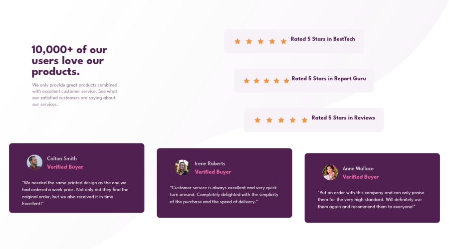
Design comparison
Solution retrospective
How can I prevent scroll of elements when reducing size of the browser? How to make the elements stay at their place while minimizing so that they do not disappear from the viewport? Is writing more media queries for different resolutions is a fix or is there some other way as well? Currently I have written only 1 media query.
Any feedback is welcome. Thanks! :D
Community feedback
- @correlucasPosted about 2 years ago
👾Hi Arush, congrats on completing this challenge!
Amazing solution! I’ve just opened the solution’s live site and I liked the job you’ve done a lot. I’ve some suggestions for you:
The html markup for this solution its built entirely with
<div>
and you can improve it using semantics tags to describe what its inside each block of content. You can replace the<div>
that wraps each card with<article>
you can wrap the paragraph with the quote with the tag<blockquote>
this way you'll wrap each block of element with the best tag in this situation. Pay attention that<div>
is only a block element without meaning.To add the two
wave
svg background images in the (top/bottom),, the best way is by usingbackground-image
to manage it since adding them to thebody
you make sure it will be under everything, to manage different images inside a single css property asbackground-image
you use the comma inside each properties declare the single modification for each circle separated. See the code below to see your solution with those backgrounds applied:background-image: url(./images/bg-pattern-top-desktop.svg), url(./images/bg-pattern-bottom-desktop.svg); background-position: left -185px top -236px, right 10px bottom -300px; background-repeat: no-repeat; background-attachment: fixed; background-size: contain, contain;
✌️ I hope this helps you and happy coding!
Marked as helpful1@arushkumar05Posted about 2 years ago@correlucas thankyou lucas for your valuable feedback. Yes I will use semantic tags more regularly from now on instead of div so they have more meaning of what is there inside each block of content. I will try to add both the images in the background. I struggled doing that but I will try what you have suggested. Thanks! :D
0 - @elaineleungPosted about 2 years ago
Hi Arush, this can be a tricky challenge to get optimal views, and when I was working on it, I needed to experiment a lot with what looks good. I think I used maybe 3 media queries to get it looking the way I wanted. You can have a look at what I did in my solution if you're interested: https://www.frontendmentor.io/solutions/mobilefirst-social-proof-section-9YtPL58Ph
In your solution, the main thing is you have some fixed widths and paddings, and that could be causing the overflow where the elements end up getting pushed out of the viewport. I would simple remove the fixed widths and use responsive widths if needed. I also won't the padding the past out the description text from the star ratings. I used grid in my solution, but you can also try it with flexbox using
justify-content: space-between
. I also used a container in my solution to make sure the elements won't grow past a certain width.Lastly, you have a number of issues in your report, and thankfully they are fairly easy to fix since they just deal with the missing alt tag mainly. All you need to do is to add in an alt tag in each image.
Good luck fixing this!
Marked as helpful1@arushkumar05Posted about 2 years ago@elaineleung Hi Elaine, I will use the approaches mentioned by you so that the elements dont grow past a certain width and use responsive widths. Yes I will fix the alt tag which is missing from the images. Thanks a lot for your feedback! :D
0 - @AdrianoEscarabotePosted about 2 years ago
Hi Arush, how are you?
I really liked the result of your project, but I have some tips that I think you will like:
I noticed that the content is breaking at 1400px, to fix this we can call the media query a little earlier, but of course it would be better to use a relative unit of measure, to make the content adapt while the media query is not activated.
the rest is great!
Hope it helps...👍
Marked as helpful1
Please log in to post a comment
Log in with GitHubJoin our Discord community
Join thousands of Frontend Mentor community members taking the challenges, sharing resources, helping each other, and chatting about all things front-end!
Join our Discord