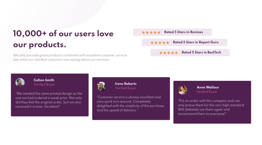
Design comparison
Solution retrospective
Let me know if i missed anything. Suggestions & criticisms are highly appreciated 🌹
Community feedback
- @YazdunPosted about 3 years ago
This looks great ! here are my suggestions for you :
-
You must put each
htmlpage content inside amaintag, also this main tag must have alevel one headingwhich says what yourhtmlpage is about, You can hide thish1or for this challenge, useh1for big title instead of using aptag. -
You have to give
altto your images. -
Cards take full width in mobile mode which is not cool in my opinion, consider giving some padding to them on small screens.
-
Last thing, Try using branches on Github instead of cramming all projects in one branch, also you can remove design files and write a clean
READMEfor your projects
✅ I hope this was helpful
Marked as helpful1@JoyShahebPosted about 3 years ago@Yazdun Thank you soo much for the well wishes and suggestions. i really appreciate it. Keep up the good work 🌹🌹
0 -
Please log in to post a comment
Log in with GitHubJoin our Discord community
Join thousands of Frontend Mentor community members taking the challenges, sharing resources, helping each other, and chatting about all things front-end!
Join our Discord
