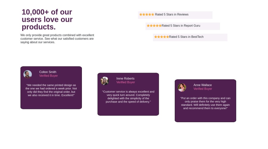
Design comparison
Solution retrospective
I did not apply the background for a reason so please do not judge me on that . How close does my design look to the solution?
Community feedback
- @TiasstiassPosted almost 4 years ago
Good job 👍 Looking at your code, here are some advices:
- Try working with margin and padding instead of relative position
- Using em or rem instead of pixels is a good practice
- Try to keep your code DRY (dont repeat yourself), for instance the cards have a lot of styling in common, By giving them 2 classes you could make a general styling for the cards and the use the other class for specificities.
Keep up the good work! 💪
1 - @grace-snowPosted almost 4 years ago
Hi Omen
Most important thing to address here is responsiveness. The solution doesn't work on mobile and that needs to be built in on all projects.
Next I would recommend you address the issues raised in your report, make headings go in order and either remove the alt text (so attribute is empty) or make it much more meaningful.
And - goes without saying now really - but I'll repeat one more time my advice to not use bootstrap and write your own css for these small challenges.
Good luck
0
Please log in to post a comment
Log in with GitHubJoin our Discord community
Join thousands of Frontend Mentor community members taking the challenges, sharing resources, helping each other, and chatting about all things front-end!
Join our Discord
