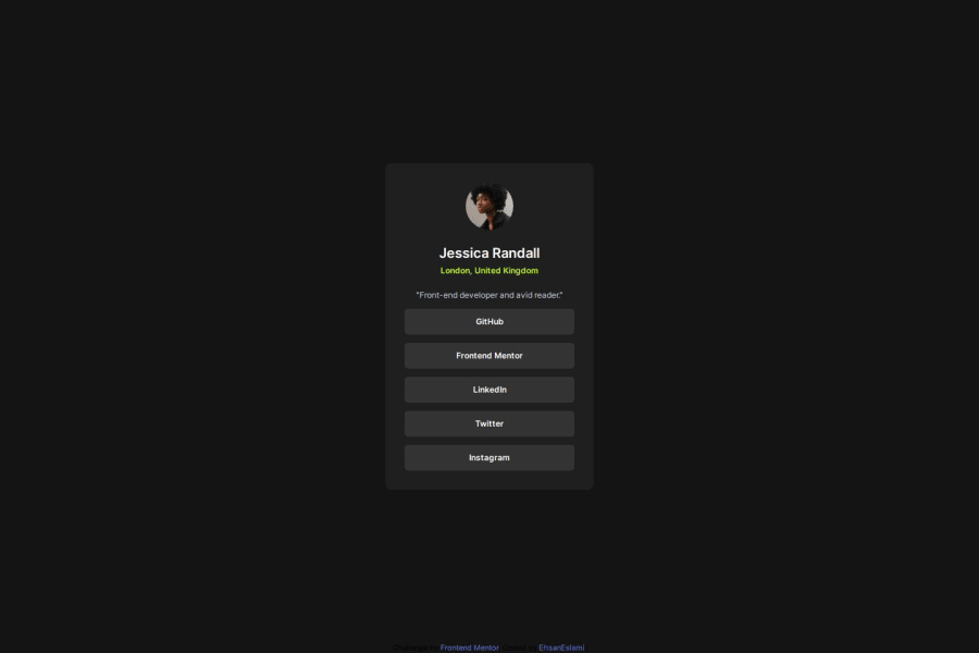
Design comparison
Community feedback
- @gmagnenatPosted 6 months ago
Hi Ehsan, congrats on completing the challenge! 🎉
Here are a few ideas I'm sharing that could help on the code structure. You can set your custom colors in your tailwind.config.js file. For your buttons, I would add a class and style it with tailwind using
@applyin your css. This could be something like that (just an example) :.button { @apply bg-grey-800 p-4 rounded-md text-base font-semibold text-white transition ease-in-out duration-200 hover:bg-yellow-500 hover:text-black focus:bg-yellow-500 focus:outline-none }You will keep your consistency with tailwind values and settings. The same apply to the other css you wrote for sections and body.
Let me know if this helps.
Happy coding ! 🧑🏻💻
Marked as helpful1@Ehsan-eslamiPosted 6 months agoMany thanks, your comment was so helpful. I really appreciate it if you have more comment and tip for help me in coding.@gmagnenat.
0
Please log in to post a comment
Log in with GitHubJoin our Discord community
Join thousands of Frontend Mentor community members taking the challenges, sharing resources, helping each other, and chatting about all things front-end!
Join our Discord
